Students who have a little knowledge of makeup should have heard of Mr. Mao Geping, the god of the beauty industry. Two days ago, Mao Geping had another hot search because of cosmetic level makeup: "Mao Geping's makeup conceals his double chin". In this makeup teaching, Mao Geping used the technique of "light and shadow makeup", commonly known as facial repair, to achieve the role of local decoration. When it comes to the principle of Mao Geping's makeup change, it is actually the same with the composition of the students' works. A good collection of works, in addition to a good foundation, that is, the content of the works has depth and breadth, also needs a good layout. Now, let's introduce the composition skills of the collection, and how to arrange the collection?
How to arrange a collection of works? What kind of typesetting is good? What matters need attention in typesetting? Today, we answer the above questions about the composition of the collection through Mao Geping's teaching of facial makeup modification. Make up is divided into steps, highlighting advantages and modifying defects; Good typesetting should also pay attention to logic, which can not only highlight the highlights of our works, but also improve the layout, making the overall look more harmonious. Mao Geping used makeup to hide his double chin this time. There are mainly the following secrets among them. Let's disassemble them one by one and put them into the composition of the collection.
Composing Skills of Collections
Clear primary and secondary, light and shadow
There are highlights and shadows in cosmetics, of which the role of highlights is to create a prominent and full visual effect; Shadows have the effect of receding and shrinking visually. Highlight key points by changing the light dark relationship.
We use highlights and shadows in the composition of our works collection, which means that our works collection also needs to highlight the key points, and there are primary and secondary contents. If you want to distinguish the primary and secondary contents in our collection, you can convey our intention to the reviewer from the perspective of layout.
The common layout method is to divide the page into 2-3 areas, which can be divided equally, or divided into uneven parts from left to right, or from large to small.

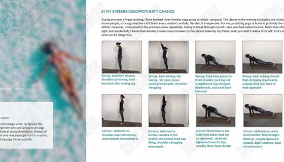
Student works of natural light
As an example of the natural light student work collection shown in the above figure, the layout is 2:1, and the larger part on the left is divided into upper and lower areas. We can build important information in the layout on the left, and separate secondary information on the right. In this way, the information in each part can be expressed very clearly, and also follow the visual hierarchy. When reading, it will feel much smoother.
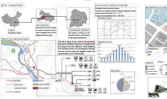
In the 1:1:1 three-way pattern, the left and right sides are information descriptions, and the middle is used to present the design drawings or model renderings that students want to show; Edge fade, coupled with color contrast, can also highlight the primary and secondary relationship that designers want to express in this layout.
Clear logical lines, highlighting the sense of lines
The reason why the double chin is obvious is related to the texture direction of facial muscle lines. If the texture is too deep or the texture direction is wrong, the sense of facial lines will not be bright enough. The same is true for the collection of works. If you want to have a sense of line in the collection of works, you need to have clear logic.
For example, industrial design or architectural design majors may not need the rich visual effects of graphic or fashion majors, but can clearly express the theme, the analysis of research results, and the design process to them, that is, clear organization will be more important than good looking.
Therefore, in typesetting, the content sequence structure can be designed to make the picture look clearer and more coherent. For example, the research, design process and other parts can be distinguished by color, which can make the whole project more organized.
In addition to content guidance, logical coherence can also be used in the project section. Most colleges and universities generally control the number of pages of the portfolio at about 20, with four projects. We can show the progressive relationship of the layout of each project, so that the reviewers can follow our ideas to see the process of everyone's growth.

Student works of natural light
If there is too much text in typesetting, you need to pay attention to the division of content nodes to avoid the accumulation of large sections of text. It can refine key points and mark key information.
Pay attention to the integrity of the works, and "bottoming out" is better
In the video, Mao Geping said, "Don't" choke your neck ", which is to remind everyone to pay attention to body posture and improve and adjust the state of our body from the source. It can be seen that Mao Geping has a good understanding of the human body structure, so we should also be confident about the overall composition of the works.
We can control the integrity of the collection from two aspects: content and overall style. Whether a work collection is excellent or not depends on the content first, and the content needs to show a visual level, that is, highlight the prominent part.
Visual hierarchy is a technique used to guide viewers to read the order of work content. If the control of visual hierarchy is lost, the whole page will look disorderly; If you arrange and combine in an orderly manner and establish a visual hierarchy, the content will become more orderly.
So how to build a visual hierarchy? In short, for example, what part of the content you want to highlight, make it more prominent. Generally, the visual hierarchy can be generated from the four perspectives of size, color, font and spacing.

Taking the collection of clothing works with complex design elements as an example, students can first judge the primary and secondary relationship when listing the contents, decide the parts they want to highlight and find the appropriate position, and then make the whole layout look logical and hierarchical by adjusting the size, floating or sinking, transparency, adding text annotation, etc.
In addition, the overall control can also start from the style of typesetting. The unity of style can strengthen the overall sense of the collection of works and make a clear visual distinction. recommend: How does the design style of the collection reflect?
Assuming that the theme of the collection is science fiction, you can use unified elements and theme colors consistent with the design to unify the style of the works.

Kaitai Collected Works Project of RCA Offer
There are many ways to unify the style. You can start from the perspective of color, graphics, symmetry, contrast, etc., and print your portfolio with your personality label.
Pay attention to white space, natural sense "nude makeup"
Mao Geping's makeup teaching has always been famous for its nature and uniqueness. Naturally, his makeup techniques and the cosmetics he uses will not give people a heavy sense of makeup, even simple and elegant, not flashy at all, and his skin also needs a "sense of breath".
The uniqueness is that he does not paint "online red makeup" or teach "assembly line" makeup. This trait is the same in the collection and layout of works. Too fancy, too full layout, or the layout of works using templates will lead to the loss of logic and highlights of works.
Some students will put all the contents in their work collections for typesetting. In order to display their own creation process and design concept more comprehensively, the idea is very good, but the correct typesetting idea should avoid the tedious and complicated pictures, and focus on the clarity and highlighting of the project.
First of all, the content should be screened; Secondly, the number of decorative elements in the collection of works should be controlled at 2-3, which will not make the collection look too fancy; Then there can be appropriate blank space to increase the sense of visual hierarchy, and the layout will also look "breathing".

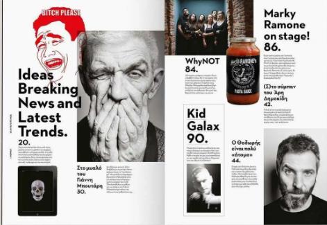
Magazine layout left blank
Of course, when we say leave blank, we do not mean that what is left must be white, nor blank or no element. Compared with the content of the collection, the background of the format is not excessively decorated. It looks neat, simple, harmonious, and all are left blank.
Typography is a commonplace topic, but many students will still ignore its importance, and in the end, it is hastily sorted out, making the work lose its proper context and logic. Through the composition skills of the portfolio, you can judge the students' overall grasp of the work, whether they have their own design style, whether they are organized, and whether they can clearly let others know what you want to express. A good one Composition design of works It can fill in the lack of visualization in the content of works, and can also add to the already good works. The collection of works that students have worked hard to complete should also draw a perfect end in the closing stage.
Recommend more composition skills for collections:
Graphic design portfolio composition tutorial, 25 graphic design portfolio composition skills
This article belongs to the original article of Natural Light International Art Education Team. Without permission, it cannot be reproduced commercially in any form. If it is found, it must be investigated for legal responsibility.


