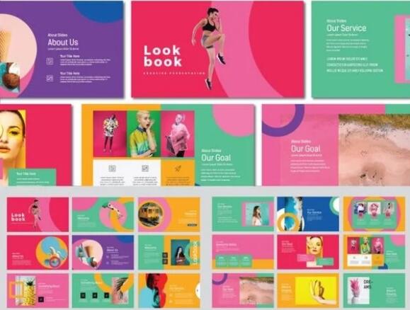
Detailed rules for color matching in typesetting of overseas works with complex colors! The layout of works with complex color matching needs careful planning and adjustment to ensure that color can not only enrich the visual experience, but also effectively convey information and emotion. While pursuing complexity and diversity, we should also pay attention to the overall harmony and order to create a collection of works that are both eye-catching and easy to understand.
Color matching of composition of overseas works
Natural light Art study abroad The teacher summarized the following details that need attention:
1. Color planning: before starting typesetting, develop a clear color scheme. Select main tone, secondary color and accent color, and ensure good contrast and uniformity between colors. Even if the color matching is complicated, the overall sense of unity should be maintained. This unity does not come from a single color, but from the coordination of color systems. You can add colors with different lightness and saturation based on the main hue to maintain overall coordination.

2. Tone uniformity: the key is to maintain the overall tone uniformity. If the color of the content in the works is not uniform, it will show a very messy appearance visually. The solution is to adjust the uniform tone of the images put into the collection in the process of post typesetting to keep the tone consistent. At the same time, the words and embellishments in the works should also maintain overall coordination and unity with the main colors of the project. It is more correct to determine the main color of the design through Mood Board and other forms after the project research, so that the project design is always centered on the theme color.

3. Sense of hierarchy: pay attention to the creation of sense of hierarchy in typesetting. Reasonably use size, location and spatial relationship to distinguish different elements, so as to form a good visual hierarchy. Put the key content on the visual center, and arrange the auxiliary information around in turn to make the whole look more orderly and clear.
4. Font selection: font selection is crucial to typesetting effect. Select the appropriate font according to the overall style and theme, which can not only convey the style characteristics of the work, but also enhance the overall visual effect. Pay attention to the uniformity of fonts, and avoid mixing multiple fonts in the same work, so as not to appear disorderly.

5. Combination of pictures and texts: Reasonably arrange the relationship between words and pictures to make them echo and complement each other. According to the content and style of the picture, select a suitable text layout method, such as center, left or right alignment, to achieve an overall harmonious effect.
6. Layout design: Layout design is the soul of typesetting. By means of reasonable layout, alignment, segmentation and decoration, the overall layout of the collection is beautiful, readable and easy to remember. Attention to detail processing, such as the use of line thickness and rounded rectangle, can add many highlights to the collection.

7. Personalization: On the basis of following the above principles, personal style and creative elements can be appropriately integrated to make the collection more personalized and recognizable. But we should pay attention to balance the relationship between personality and the overall effect, and not excessively pursue personality to destroy the overall coordination.
8. Repeated adjustment and optimization: After the preliminary typesetting is completed, it is necessary to repeatedly check, adjust and optimize until the best effect is achieved. You can invite others to provide comments and suggestions in order to further improve the typesetting effect of the collection.
In a word, for works with complex color matching, color planning, tone unity, sense of hierarchy, font selection, combination of graphics and text, layout design, personality and repeated adjustment and optimization should be emphasized in typesetting to achieve overall coordination and aesthetic effect.
Which is the best art study institution?
This article belongs to the original article of Natural Light International Art Education Team. Without permission, it cannot be reproduced commercially in any form. If it is found, it must be investigated for legal responsibility.


