For the collection of art works, typesetting is not only a icing on the cake, but also determines the presentation effect of our works to a certain extent, and whether we can get the first impression score that makes the admissions officer feel happy. The key to how to complete the layout of a set of works with both comfort and personalization is that we should treat the layout as another set of visual works besides the works set project. Since it is a visual design work, we will have methodology and practice methods, so today we will take the illustration professional composition, which can best reflect the style and most abundant visual elements, as an example, to introduce the layout tutorial of the illustration works collection!
Tutorial for composition of illustration works:
Draft composition is a concept familiar to all students majoring in hand painting and art. When it comes to illustration, if there are steps, the first step is often to draw sketches.
Only by correctly understanding the meaning and role of the composition sketch, can we make a choice. How to draw and place elements in the small script of illustration composition can be understood from three aspects: the selection of objects in the composition, the placement of objects, and the style and techniques.
Selection of elements
The first thing to talk about is the selection of elements. When students compose pictures, they usually only think about how to place objects, but forget that before considering this problem, they should first consider what is expressed.
In painting, a very direct and simple expression is the selection of painting objects. Because of the cultural environment, historical background, or other special context of creation, various objects that are objective in themselves but have no ideographic meanings will have special meanings because of the description of the creator. Readers and audience will also interpret and interpret from this.
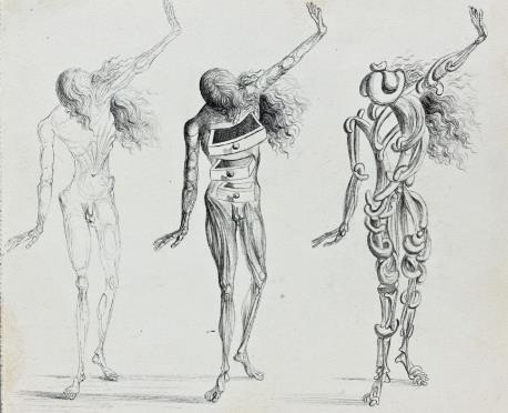
Therefore, the first thing to consider in the drawing of small sketches for illustration and composition should be the selection of objects. For the creation of an illustration, in addition to some objects that cannot be replaced, there are many objects and details that need artists to use their imagination to choose and combine freely. Share a Illustrator Collection Example 。

Salvador Dali,Untitled,Undated
Find the possible internal connection between objects and use this connection to tell a story. For example, in surrealist painting, there is a very cautious and sensitive choice of objects.
The same is true for the layout of our collection of works. The first thing to do is to select materials. Most colleges and universities require that the number of pages of the portfolio should be controlled within 20 pages, while a portfolio contains 4-6 project works, each of which roughly occupies 3-5 pages. How to reasonably place the research, construction process and design drawings in this limited page is what we need to analyze.
The creation process of works is a long time work, and our typesetting should consciously create suspense in the way of presentation according to this timeline. Select the pictures that best show the project style and personal advantages, pay attention to the proportion of words and visual elements, and then connect them with appropriate visual elements through our logical thinking and imagination, which is the purpose of selecting materials in the first step.
Element placement
After selecting specific elements, the next thing to consider is of course how to place them, which is also the most important and critical step in the composition and typesetting process.
When many students hear about composition, they only know some common composition rules of triangle composition and diagonal composition, and then put materials of appropriate size according to the rules after selection, but this is actually a misunderstanding of composition.
When we refer to the classic works of artists, the composition method presented to us is determined by the elements of the picture itself, and the rule itself is only the law summarized by later generations. Whether it is painting or collection of works, the placement of materials is not just for the purpose of putting into an orderly shape.

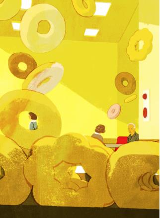
Tatsuro Kiuchi
It needs to be understood that the placement of objects is one of the ways to build a visual hierarchy, and its purpose is to make the picture more visual order, and more clearly express the main idea. The order of vision includes space, strength, size, contrast and unity, in addition to the shape relationship between object positions.
Take the following two figures for example, different placement will produce different visual effects. With the help of some auxiliary lines, the picture presents a changing spatial relationship and visual order.
This is also the key point of the layout course of the illustration portfolio. Considering the review process of the portfolio, the admissions officer's eyes will not stay on each portfolio for too long. We should reasonably allocate the prominent points on each page, add hierarchical changes in different parts of the project, so that the admissions officer can clearly find the highlights of the design project.
For example, there are many words in Research. How to accurately introduce the background, show our rigorous research ability, and not too boring in the vision, we can reasonably use icons, color matching, and simple and intuitive typography to guide the vision.
Because there is design logic as an invisible series, we can also be more flexible in the specific operation of typesetting. We can show the creation process through the change of theme style, with the combination of primary and secondary, tightness and flexibility, and focus on the details and key points in each project.
Overall style and techniques
The last point is the style and technique of the composition of the collection of works, which most students will ignore or difficult to grasp.
When it comes to style and technique, most students will take it for granted that this is the stage of project production, but whether it is the draft link or the final layout, the style, technique and expression of all pictures are inseparable.
Japanese illustrator Tatsuro Kiuchi is good at using visual perspective to create space and highlight personal style: style will determine what kind of object the creator tends to choose and how to paint the object. At the same time, how to express the object they want is also affected by the techniques.

Tatsuro Kiuchi
Therefore, in the first two stages, when selecting and placing materials, if the style and techniques are completely ignored, it will easily lead to two consequences: first, the final picture is very ordinary, without visual intensity; Second, I thought it was good when I was thinking about it, but when I was preparing for the final typesetting, I didn't do anything right. It was not the effect I wanted when I first painted the composition.
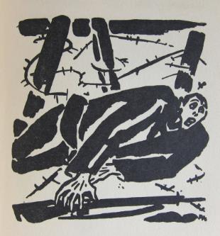
The following figure shows the composition draft of Frans Masereel. It can be seen that his rough and emotional ink strokes come down in one continuous line with his black and white woodcut style:

Frans Masereel,GISTEREN NOG MISDAAD...HEDEN
The fundamental reason is that we did not integrate the concept of style into the concept of typesetting. Like project works, typesetting also needs a unified style, and the simplest way to choose a style is to fit the theme of the work. Different projects can differ slightly, but the final effect should be harmonious and unified.
Although the current visual aesthetic trend will place more emphasis on simplicity and informatization, including many templates or portfolio typesetting tutorials on the market, which advocate weakening personality and aiming at "stability" and "error free", in real typesetting, harmony does not mean mediocrity, and proper highlighting of style can not only catch the eye of admissions officers at first sight, It can well convey the main idea of the whole project and present more complete and personalized project works.
The second is the integration of techniques. With style, we can also carry out appropriate "creation" in the selection of paper materials, color matching, and binding forms in the typesetting stage, to create the atmosphere of the screen space from different dimensions, giving the admissions officer a more emphasized visual impression.

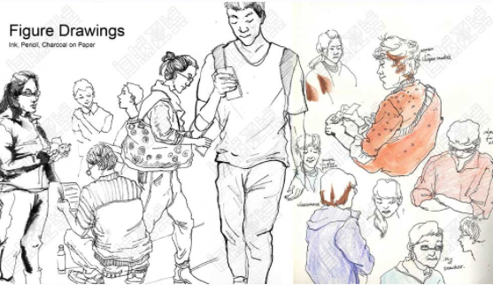
Yiran's Collected Works of Natural Light Illustration Major
Whether it's illustration or composition of works, including any other art discipline, the key to composition and composition is spatial layout, which requires us not only to pay attention to overall planning, but also to be aware of each step in the creation process, to select each link in the picture carefully, and to integrate our own ideas and creativity.
It is less than three months since the start of the 2020/2021 application season. Most of the students of Natural Light have entered the middle and later stages of the collection creation, and typesetting is not the last link to be considered. Through today's sharing, we hope that students can plan in advance and take typesetting as an additional test in the collection of works, Get the key bonus items with the right creative method!
More portfolio publishing tutorials to share:
Sketchbook layout of works, telling the key points you don't know
This article belongs to the original article of Natural Light International Art Education Team. Without permission, it cannot be reproduced commercially in any form. If it is found, it must be investigated for legal responsibility.


