The importance of composition of works does not need to be described too much. As a basic design course, natural light composition is one of the compulsory courses for students of all majors. We have also introduced the composition skills of works to you. I believe that most students are familiar with the general composition rules of "more pictures and less characters", "simple and beautiful", "visual impact", etc. However, there is another situation where it seems that none of these techniques can be applied, that is, how should a project with more text and less pictures be typeset? How to optimize the visual experience through the layout design of the collection of works with many words? Today, let's give you a detailed introduction.
In fact, this situation is not an individual case. For many works of space specialty, design innovation department, and interdisciplinary specialty, a large number of text descriptions and experimental processes must be elaborated to achieve the purpose of completely conveying the design concept and theme of works. Today, we will provide some directions and skills for further improvement of the composition design of the collection of works in this situation, to help you, on the basis of perfect project works, through visual effects Portfolio training Add more competitive advantages!
Use too much decoration carefully
The beauty of the collection is the first consideration of most students in typesetting. So when faced with our works with more words and less pictures, many students will choose some complex fonts or frequently use some decorative color blocks, insertion symbols and other methods because they are worried that their works collection is not "beautiful" enough.

In fact, this kind of composition design method of the collection of works is very undesirable. First of all, a lot of text content itself means that the work has a lot of important information to be seen by the admissions officer, and the marking mode of overseas colleges and universities does not allow the admissions officer to pay too much attention to the visual elements other than the project itself.

So what we need to do is not to add useless decorations but to "reduce the visual burden". The first step is to choose the font that is easy to read as much as possible. Students can choose the specific font and size according to the tonality of the project itself. If there is no special style, my suggestion is to choose the slim and common font as much as possible.
Secondly, in the selection of text content, we should learn to remove duplicate and invalid text. In the process of research and experiment oriented projects, we will collect a large number of first-hand and second-hand data, but not all processes need to be put into the work collection.
We ensure that the highlights are selectively retained under the premise of reasonable logic. For the screening method, we can use the clear reproduction design process of Mindbook to summarize the key points and put them into the work collection.
Finally, we need to coordinate the relationship between words and pictures in the layout design of the collection of works to avoid words or pictures appearing on the same page, and pay attention to the overall coordination; In addition, we can make good use of the summary subtitles or short text as the visual focus to increase the richness of the composition of the collection.
Focus on the visual hierarchy of content
For the works with many words, the students are most worried about the lack of visual attraction, and can not catch the eyes of the admissions officer. Indeed, compared with many elements and more intuitive pictures, text lacks rich visual changes in presentation form.
Therefore, the key point of our portfolio layout design is to break the original plain text content and add different levels of changes, so that the admissions officer can clearly find the design focus.
A fascinating book can attract readers only by words. It must rely on rigorous logic and consistency of content, and so does our collection project.
The creation process of works is a long time work, which needs to go through research, analysis, experiment, scheme implementation and other improvement processes, and our typesetting should consciously create suspense in the way of presentation according to this timeline.
For example, many student associations are eager to show their own advantages, and will focus on the best part of the project on the first two pages. The ranking of projects is also from excellent to weak. This way allows the admissions officer to see the results and the biggest flash in the works prematurely, but will lose the attraction of the whole set of works.
But if we gradually build a complete scenario according to the project development process, even if the admissions officer has not reviewed the whole set of works, we can clearly understand our design ideas and the entire design process.
Secondly, because there is design logic as an invisible series, we can also be more flexible in the specific operation of typesetting. We can show the creation process through the change of theme style, with the combination of primary and secondary, and tightness, while focusing on the details and key points in each project.
Enrich details according to theme and specialty
In the first two points, we mainly give some suggestions for the typographical errors that are easy to occur in the works with too many words. The principle is still how to "win in stability". If students need to continue to enrich the visual presentation of the collection of works as time permits, we will talk about suggestions and methods through different majors.
Architecture
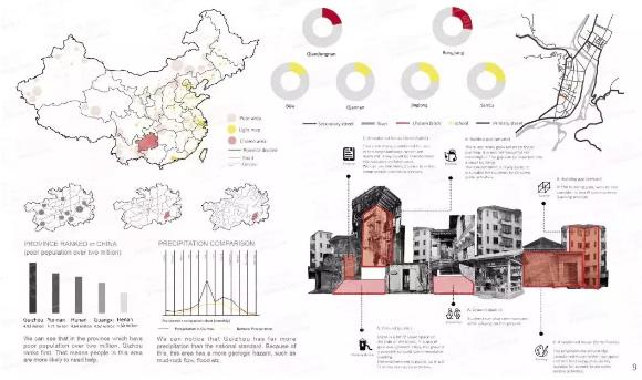
Most of the design projects of architectural space specialty are large, and the whole design process contains heavy information. Text, as an indispensable explanation, is mainly concentrated in the early research and data analysis, while the focus of composition design of works collection is to alleviate the visual pressure and enrich the expression form of text.

For the part of data research, we can try our best to transform the text into a more intuitive form of charts and software schematics, so as to avoid the phenomenon that large pieces of text are difficult to read.
In the case above, Pei's four projects selected in her works are all social and humanistic topics, and the research workload is very large. She combined many data charts, which not only achieved the function of clearly expressing information, but also eased the pressure of reading; In order to make the text and data have a certain continuity, the text is aligned up and down with the chart, and the whole picture looks more exquisite.
Department of Design Innovation
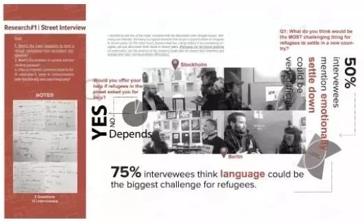
For example, product design, industrial design, service design, etc., these professional works are more like a rational derivation process. We draw out the design results step by step through preliminary research, data analysis, subsequent model drawings, experimental tests, etc.
The whole set of works relies on the description of words for more rational analysis. In order to increase the artistry and richness of content presentation, we can select some plane elements such as colors and icons for embellishment.
For example, change the background color of the collection of works in accordance with the project theme, select a conceptual art map with strong visual impact, and "decorate" the arrangement, color, font, etc. of the changed text. Of course, the principle is not to dominate, and the ultimate goal is to optimize the details of the work to the best visual effect.
Pure Art Major
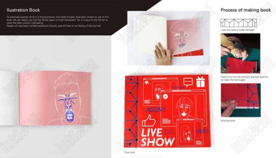
The role of words in the collection of pure art works is mainly to explain, because the themes and finished products of such works as installation, illustration, photography are relatively abstract, and how to better describe the emotions reflected in the works is the key point of typesetting.
But compared with other majors, Pure art study abroad The focus of the composition design of the collection is mainly on the presentation of the renderings, so we can also choose fonts with the same tonality with the style of the works. Fonts have personalities, and different fonts will bring us different senses: for example, serif fonts in English will be more retro and emotional, while most sans serif fonts reflect simplicity and solemnity.
Secondly, try to reduce other decorative elements, but use to change the relationship between pictures and text to enrich the visual effect of each page through cutting, enlarging, shrinking, centering and other forms. The purpose of text is also to guide the visual focus to the project itself.
The competition for art study abroad is increasing. In the final stage of the preparation of the work collection, each student wants to show the best side as far as possible. Under this high level of competition, the handling of details is also a key point that we cannot ignore. For the works with a large number of characters, there are certain restrictions on the layout design of the works, but students should not significantly reduce the immature renderings of adding characters because they are worried that the composition of the works is not brilliant enough. You still need to clarify the priorities. The portfolio is just like the resume of each student. The decisive factor for obtaining an offer is not only how gorgeous the paper and decoration are, but also the core competitiveness shown in the resume, that is, the portfolio project itself.
This article belongs to the original article of Natural Light International Art Education Team. Without permission, it cannot be reproduced commercially in any form. If it is found, it must be investigated for legal responsibility.


