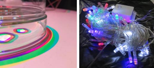
I wonder if you have ever met this situation: in a sunny afternoon, you can take photos with your friends and record your life with beautiful natural light, and find that the colors of pictures on different mobile phone screens are different! The IOS system image we know everyday is mostly warm yellow, and Android is basically high saturation photos. You think that the color difference caused by different systems is actually due to their different color modes! Including the creation process of our collection of works, it may appear that the display color of the computer screen is completely different from the printing color. These color patterns appearing in our design have the secret of keeping the works "fresh in color". Now natural light takes you to understand the use guide of the color pattern of the collection, including RGB, CMYK, Web color, Pantone, and so on.

IOS system (left), Android system (right)
Guide to using the color mode of the collection:
01. Differentiation, application and principle of color modes
RGB
RGB color mode is the most widely used color system at present, which originates from a standard color in the industry. It is the color that we can perceive visually, and it is also the most common color mode in life and design. In brief, the main colors of RGB colors are red (R), green (G), and blue (B). Through the superposition of these three colors, various colors are generated.
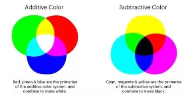
RGB color mode is set through the principle of color luminescence, and can also be seen in a completely dark room. If you can't understand, you can imagine RGB as red, green and blue lights. Through their brightness superposition and mixing, new colors will be produced continuously. The more colors are superimposed, the brighter the effect will be. This is additive mixing.

Image source ins color_rgb
CMYK
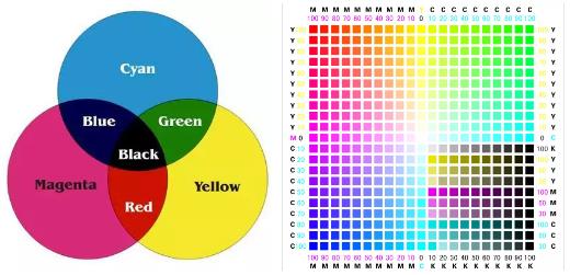
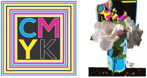
CMYK appears on the screen we see, and the books we see need to rely on external light sources to see. It is a chromatic pattern used in printing, that is, printing color pattern. It can be seen on all printed materials, such as books, magazines, newspapers, etc. The three primary colors are superimposed into four colors, which are Cyan (C), Magenta (M), Yellow (Y), and blacK (K).
CMYK is produced by the reflective principle. The reflective light comes from the sunlight, light and other light sources we need when reading. They absorb external colors, filter some color wavelengths through white light reflected by light sources, and form CMYK colors seen in our eyes, using subtraction mixing.

Image source baidu
Web
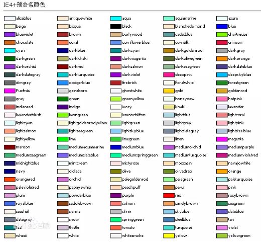
Web Color is a common color used in website applications. It has two modes, one is Web standard color, the other is Web security color. Web standard color is a color used in web script with English name, extracted from RGB color.

Image source baidu
Web security color is generated by adapting to the electronic application end. It is related to our website, interface and other designs, but it is not often used.
Web Safe Color
Web security color is a color that adapts to Mac and PC terminals. Because we use different electronic devices, each of us faces a different palette of platforms, web pages and browsers.
When different colors appear in the web page, the web security color will neutralize the color we see, and according to the user's needs, the system will adjust to fit the color. Most devices now support many colors. It is wasteful to only use Web Safe Color, because it is difficult to achieve even basic gradient effects.

Image source ins
HSB
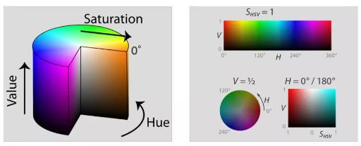
HSB is a color mode that often appears in design software, representing Hues (H), Saturation (S), Brightness (B), and the color medium is our eyes. HSB is equivalent to HSV, except that the value (V) was later changed to Brightness.
HSB generally appears in the color adjustment part of the design software. The higher the value of H and S, the higher the saturation, and the brighter the color, which is not suitable for long-term viewing. The color picker of PS software is the HSB color mode.

Image source baidu
Lab
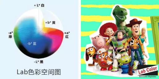
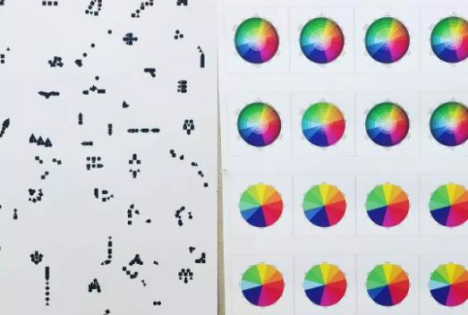
The colors we can see can be represented by Lab. Labs represent Luminosity (L), the range from magenta to green (A), and the range from yellow to blue (B).
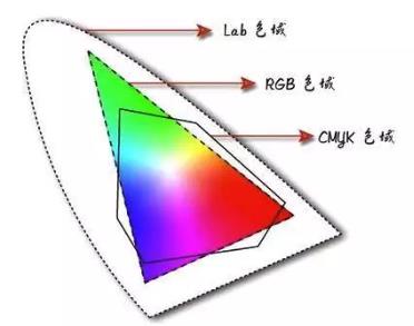
Compared with other color modes, Lab does not rely on devices, and its own color gamut is very wide, covering RGB and CMYK color gamut. It has some advantages in digital graphics processing. Lab image storage methods are mostly attached to PS and other design software, such as PSD, PDF, TIFF, etc.

Image source ins lab.color
Pantone
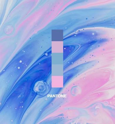
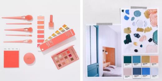
Pantone is an authoritative organization for color development and research, with a complete color system comparable to other color models. Pantone releases its annual color in Miami Beach every year, which is similar to the time and place of Art Basel exhibition. The annual fashion color report released every year has also become the fashion color trend referenced by major fashion weeks.
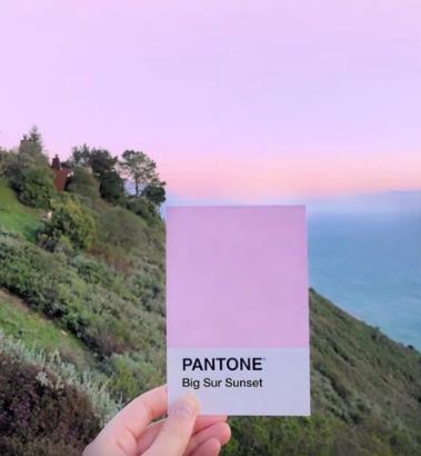
Pantone color card is the most famous color template in the art field, which appears in many fields of art design: clothing of clothing design, packaging of product design, posters of graphic design... You can see it when you travel and make up!


Image source ins Pantone
After introducing the different color patterns of the collection and understanding their characteristics, let's see how to apply them to the design. Their respective design applications may become the key to the collection of works!
02. Use method and design application of color mode
medium
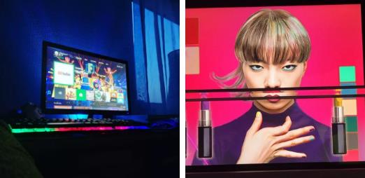
In daily life, these color patterns are ubiquitous, and they often appear in the process of creating color patterns in our works. RGB color mode mostly exists in electronic displays, projectors, digital cameras, scanners and other media, and is very dependent on electronic devices.
Because the color overlay gradually brightens, the final RGB blend color is white. The color mixing advantage of RGB lies in the mixing of channels, which is more comprehensive than other modes. Of course, the advantages of different color modes can be maximized by selecting appropriate design tools.

Image source ins color_rgb
Because CMYK is a printing mode, the media are mostly printers, printers, inkjet machines and other printing equipment, which often appear in our design albums, brochures, posters. Its own subtractive principle leads to the final color being black.

Image source ins
The advantage of Lab mode is that it emphasizes color change, that is, color mixing we often contact. Lab mode is very suitable for adjusting some bright and bright colors, because its color is separated from light and shade, and it can save brightness information and color information separately.
Color hue is very important for our design Studying abroad in photography As well as other visual arts majors studying abroad, what they pay close attention to is also an element of HSB color model. The saturation, brightness and other color elements seen by our eyes are mostly output by HSB, and it can provide the most comfortable color for our eyes.

Image source baidu
We often find that the printed version of a design project is very different from the original color effect. The difference between them comes from the difference of these color modes themselves and the difference of color gamut between them.
So what method can be used to avoid the color difference in design creation? Next, let's take a look at the important ways to avoid color loss.
usage method
For easier understanding, students can regard RGB as the enhancement mode and CMYK as the subtraction mode. The color gamut range of RGB is wider than that of CMYK, so the display color is richer.
In printing, the ink color we use is CMYK, and RGB with wider color gamut is difficult to be fully presented in CMYK mode, which is why the color fading phenomenon occurs when RGB is converted to CMYK. If we want to make the design color close to the original chroma, it is safer to use CMYK color mode.

RGB color mode (left), CMYK color mode (right)
In color expression, the gamut size is Lab>RGB>CMYK. We know that in PS, Lab color mode is more convenient for users to adjust colors. Its wide color gamut can be said to be an advantage, but it will also bring corresponding reaction.
RGB has lost a lot of color in the CYMK mode, and the color gamut is higher than that of the Lab mode of RGB. The color sense actually displayed will produce more distortion effects. The processing method to avoid color distortion is to edit the image from Lab mode and print it in CMYK mode.

Image source baidu
When our design needs to be presented in paper, we must first convert Lab, RGB and other color modes higher than CMYK to CMYK mode, so as to prevent color loss during printing and ensure the visual effect of color.

Image source ins Pantone
In the creation of the collection of works, students are advised to refer to the Pantone color card in case of high requirements for color accuracy, because many colors cannot be confirmed by the naked eye. After all, they have different display effects in different devices, and can minimize color distortion.
For example, the following TSX polyester color card set Polyester Swatch Set is a set of color cards specially created for designers of clothing, furniture, textiles, fabrics, etc., which is convenient for design and color mixing. It can be applied in a wide range, including sportswear, swimwear, pajamas, textiles, shoes and socks, etc. It can also complement other Pantone color card series.
Design application
RGB and CMYK, as the two most widely used color modes, often appear in the field of art design. They not only add to our design, but also lead us to think carefully about the collection creation.
RGB is widely used, mainly in the LED field, screen display and video output. RGB's 16 million colors can bring people ultimate visual enjoyment. In addition, there is another area that we often come into contact with in our life - product design, such as the color number of cosmetics.

Image source ins
Most of the product design color numbers come from RGB color mode. For example, for Channel 90 #, people will always remember the color number of a lipstick, but will not mention an RGB (255111, 72) color lipstick. Have you ever wondered why these brands, including our product projects, do not mention the colors used? These colors are universal, but appear in the design and become a kind of privacy?
If the color logo used in the design is provided, then anyone can apply it, which will cause loss to the brand image building. The same is true of our design. Every detail should be taken into consideration when creating. What the admissions officer wants to see, what parts need to be fully displayed, and what needs to be "hidden". It is not limited to product design, which should be carefully considered by students of each major.

Image source ins
CMYK often appears in Collection of Graphic Design Studied Abroad In the process of printing, the processes involved include film covering, bronzing, UV, etc. Whether it is a specific requirement of the design link or the actual effect of the collection, the collection creation will inevitably encounter the printing process. For example, brochures, business cards, posters, etc., these design works need to be printed in large quantities. When designing, we should consider not only the creation content of the collection, but also the realizability of the work.
In each step of design, we should take into account the problems we will face when creating, including the embodiment of color effects, the selected process, and so on. For us, the feasibility of the works is the first assessment from the works themselves before the collection meets the admissions officer. It is a pity that our works cannot achieve the design results when they are finally formed. Good content and practical application are two different things. We should consider the feasibility of the work at each stage of design.
The natural light introduces the guide to the use of color patterns in these collections. These color patterns appear in every step of the creation of our overseas art collections. For example, the interface color block of UI design, the color matching of animation design, the cloth color of clothing design... Every content we see in the design is closely related to the color mode. The application fields of RGB, CMYK, Web and other color modes are actually different, and their corresponding design methods are also different. But it does not prevent us from using our own design scheme through understanding.
Today, we have learned their application and principle in terms of the distinction of color modes in different collections of works. Through their media, we know how to use them and their application in design. I hope that students can look at every detail of the creation of the collection carefully while deepening their understanding of color. It is these trivial details that determine the success or failure of our application.
Natural light shares more topics for you:
How to rationally deal with the "emotional" of the collection of works created by studying abroad
What Problems Can Not Be Ignored in the Creation of Collection Training_Creation_Art Studied Abroad Collection
This article belongs to the original article of Natural Light International Art Education Team. Without permission, it cannot be reproduced commercially in any form. If it is found, it must be investigated for legal responsibility.


