As a popular major for art students studying abroad, interaction design is also the first choice for many "non art students" to change their majors. The first reason is that in this information age, interaction design talents are just in demand; Secondly, domestic colleges and universities have not set up a special interaction design major at present, and most of them just extract UI design as part of the graphic design course. Compared with other majors, foreign art schools pay more attention to the unity of function and beauty for interactive works. To achieve these two points, the use of color is crucial. Color is not only a part of interface design, but also an important means to improve user experience and realize human-computer interaction. It is an important point in interactive design works that cannot be ignored. To help students point out the correct direction of creation, today we bring a guide to the use of color in the collection of professional interactive works, which will be explained in detail according to specific cases, How to use color to create the most attractive interactive professional works!
There are two extreme trends in the creation of professional interaction works. One is to only pursue the beauty of works and focus on attracting users with interface design; The other is to use a large number of research and experiments to prove the practicality of the work. All functions take priority and interface design is optional. Both trends are due to the incomplete understanding of interaction design. A complete collection of professional interaction works can not be separated from early research and analysis, design modeling, test verification and final terminal interface display.
1. Formulate page color scheme
Like any visual works, interactive design also needs to develop accurate color scheme. Now in the market or in some cases of website design, we see almost the same minimalist style and Macaron color system. If students look for color matching inspiration from these existing cases, it is difficult to stand out visually and attract the attention of admissions officers.
Therefore, if we want to develop a harmonious and creative color scheme, the best way is to look from our own projects and visualize the design theme and process. First, we can select a keyword according to the theme, such as pet app design. The keyword is lively and fresh, and the keyword is sharp and cool for scientific and technological web page design. Then we can determine a theme color according to the keyword and develop a unified color scheme.
But the interactive design works are different from other works. The color of the page is not invariable, but will produce a very variable visual effect according to the transformation of the interface and the user's operation. Therefore, our color scheme needs to produce more detailed changes according to the dynamic changes on the premise of ensuring harmony.
In order to highlight the key points and guide user interaction, we should first distinguish the background color and theme color, use a small number of high colors to highlight the key points, effectively distinguish the content, produce a certain visual impact, and ensure consistency with the overall tone.

harvest Parsons School of Design Ruoyu, a student of Parsons' interaction professional offer, was inspired by the experience of her friends. The friend and Ruoyu complained that waiting in the pet hospital is a very boring and boring thing, because you often need to spend 45 minutes or more to wait.
This makes Ruoyu wonder whether we can have other activities to "consume" boring time in the pet hospital besides waiting? This project came into being.
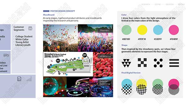
The color use scheme of this set of interactive professional works is to develop a fresh and soothing visual style according to the style of the pet hospital. Two low saturation contrast colors are selected as the highlight colors, and the two slowly blend to extend the other colors. The final effect is harmonious and not boring.

2. Emotional factors of color
Many interaction majors will choose projects with humanistic themes to focus on some audiences and solve the real problems they face. Therefore, it is very important to reflect humanistic care in interactive works in order to obtain better user experience. We can achieve this through rational use of emotional factors of color.
Scientific research has proved that people will have strong associations with specific colors or color combinations, triggering different mood or state hints. For example, red represents intense and tense emotions, so many software message alerts will be marked in red; Another example is the combination of red and green represents Christmas; Blue means technology and so on.
Therefore, in the face of different cultures, backgrounds and groups of people, students must choose colors in a targeted way during the creation process, and carry out as detailed research as possible in the early stage, present the user pain points found through observation in the form of color, and incorporate their own design concepts to meet the purpose of the user's visual beauty as much as possible.
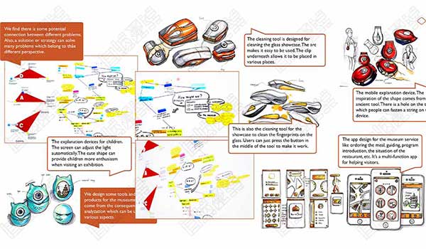
This is to gain University of Sydney A group of interactive device works in the works of Jia Yi, a student of the interaction design offer, whose theme is to explore the exhibition space of the soul. Jia Yi's original intention of doing this group of works is to help people ease their fear of death and reflect the human soul in a visual perspective.
We can see many dazzling colors in this group of works. In addition, the final presentation mode of this group of works is the combination of interaction and devices. Compared with the presentation in other plane interfaces, this form of expression will also have more visual impact;
Secondly, in order to express the heavy topic of death, JiaYi did not choose the steady dark color, but also tried to use the extremely bright color matching to express the emotion of humanistic care in the product more clearly, which also meets the needs of people oriented users in the whole work.
3. Changing color interaction
The most fundamental function of interaction design is to realize the interaction between products and people. With the development of science and technology, the forms of interaction have become diverse. Attracting user interaction through dynamic forms has also become the development trend of current interaction design, and is also the focus of art schools to investigate future designers.
Therefore, our interactive works must not only stay in the design of static interfaces, but also reasonably plan the interaction ideas, and use visual elements to help the products to play an accurate and harmonious interaction. The use of color in the interactive professional works collection is an important means of transmitting information and connecting visual lines.
First of all, we can change the color of key information through user operations to achieve the purpose of conveying indicative information. The change of color is actually to strengthen the content in a dynamic form, so as to form a more intuitive visual feedback.
Secondly, the same color will produce different vivid expressions through the changes of different rhythmic rhythms. For example, the diffusion, vibration and distortion of color blocks can give users different degrees of psychological hints, and have achieved the purpose of guiding and expressing the product effect.
Ruoyu's project is a redesign of the visual system of Artehouse, because she found that the original visual system of Artehouse was not consistent with its own brand and product tonality, so she decided to redesign a series of visual systems for it.

In this process, Ruoyu Students created a random aesthetic concept combining art and technology. Instead of using a specific color or figure as a unified visual element, she used a mathematical function called Bacteria Function to insert the numbers A and B (where A<B) into the function, so as to create a circular area figure with two organic closed shapes.
These figures have a high sense of mystery and future technology, and are very suitable for Artehouse. In Ruoyu's opinion, mathematics is technology and design is art. The process of inserting numbers and obtaining shapes is the interaction between her and technology, which fully reflects the characteristics of Artehouse.
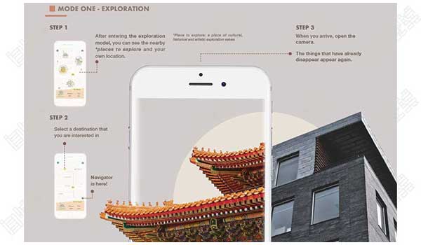
Ruoyu's biggest transformation of the original work is from a single trigger interaction form to a more diversified interaction form. Among them, she did not change the original color matching significantly, but also realized the dynamic gamut with the use of code and functions.
This also made her final works produce rich and scientific visual effects, achieving unity in vision and dynamics. She realized a new experiential and exploratory art form with changing color interaction, and also demonstrated her pioneering thinking and more comprehensive design ability to colleges and universities.

As an emerging major, interaction design is a zero foundation for most students, so our first step before creation is to establish an accurate and comprehensive understanding of the interaction major; Secondly, if you want to complete an excellent collection of professional interaction works, you must supplement the basic knowledge.
As the threshold for designers to get started, the use of color in the interactive professional works collection has always been a very important part of the natural light curriculum system. The basic course of natural light is divided into two parts: theory and techniques. This is also to help students learn relevant software skills on the basis of building basic artistic aesthetic ability and critical thinking, and have a deeper understanding of the application of professional creation. The two are integrated to improve students' comprehensive ability. The advantages of this learning method are more obvious in the creation of interaction professional works collection, which can help students to fully present the design process in an excellent visual form, achieve the effect that works are both aesthetic and functional, technical and artistic, and finally gain the favor of admissions officers and colleges!
Are you still going to study this year after applying for art study abroad?
American Interaction Design Ranking (HCI/UX/app Design Category)
This article belongs to the original article of Natural Light International Art Education Team. Without permission, it cannot be reproduced commercially in any form. If it is found, it must be investigated for legal responsibility.


