Color is the first element in visual works to come into view. Appropriate color matching of works can easily achieve indiscriminate attack, and let the audience directly get the atmosphere and visual experience you want to create. Color runs through the creation of the whole collection of works, and it is an essential performance focus whether it is research, elements, finished products, and typesetting. But at the same time, the color design is very "perceptual", and there is no rigorous logic and law to follow, which often makes people confused. How to match colors to find the right benefits? Maybe we can try to find inspiration from artists. Design needs restraint, and color can also be subtracted. A mature color system can sometimes have a direct impact on people's minds.
How to do the color matching of the collection?
Kapoor's red, Eve Klein's blue, Robert Lehman's white, artists always have their own preferences for colors. Choosing an appropriate theme color can also bring our works an unexpected sense of sophistication. Today, we will recommend some beautiful colors for you to explore the mystery that artists of all ages use them to bewitch people! What if the inspiration source of the collection is exhausted?
BLUE
In everyone's impression, blue represents the twilight sky and the vast sea. It is thought-provoking and reassuring. It is an eternal color system. This year, PANTONE also rated this classic blue as the representative color of 2020.
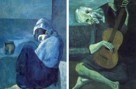
As a color full of profound meanings, the artists who prefer the blue color in each period are out of the pursuit of purity. During the period from 1901 to 1904, Picasso only used blue in a large area of his paintings, which was called the "Blue Period" by later generations.

[squatting woman] [old blind guitarist]
Behind the color is the artist's perception of life and art during this period. During this period, Picasso's style of works was questioned, followed by a tight economic situation. In addition, his friend's suicide cast a shadow on his heart, and he was also influenced by artists such as Van Gogh and Gauguin in the same period. The superposition of various factors led him to choose this relatively strong blue color to express his mood.

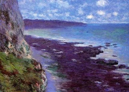
Monet [Sea]
When it comes to the blue system, the most famous one is International Klein Blue (IKB), which was introduced 50 years ago. This blue is known as an ideal blue and absolute blue. Its clearness and openness often make people lost.

Yves Claret
This color was named by the French artist Yves Klein. Klein believes that only the most simple colors can evoke the strongest spiritual feelings. Klein chose to return to simplicity, and the fact has proved that Klein Blue is already dramatic enough because of its strong visual impact and limited collocation with other colors.
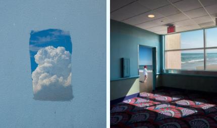
The blue in the works of Kang Hee Kim, an American Korean photographer, has become more inclusive. She is very good at creating a realistic utopian world with less saturated blue between the city and nature.
Kang Hee Kim often travels to the streets and alleys of the United States to take photos due to his life background, and then collages them into pieces of works with a strong sense of fiction and surrealism through Photoshop. The blue color often appears in the works also takes the viewer's thoughts farther.

WHITE
Looking back at the history of art, white is a touchstone for the talent of artists of all ages. Whether it is exquisite and elegant ancient Greek sculpture or the white label of Maison Martin Margiela, a fashion genius, white can bring the artist's ideas to the extreme.
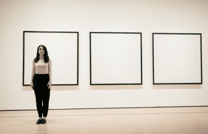
If you search for "white" and "priceless works of art", you will surely find the name of Robert Ryman, the most famous minimalist artist in the contemporary era, whose creation process is always accompanied by controversy and praise.

Robert Ryman is famous for his strict research on the form of monochrome painting. He likes white and is good at using various white pigments to paint on various surfaces such as linen, glass fiber, vinyl, jute and wallpaper, forming a unique texture and light sense.
His landmark work is a group of pure white paintings named Untitled, which made an uproar in the art circle in 1961 at a market price of 20 million dollars. This group of paintings that at first appeared to be confusing will find its subtleties after everyone has carefully experienced them.
For disputes. Robert Ryman is never afraid. He once said: "I am not a painter. I do not create patterns and colors. I use real light and space to work, because light is an important aspect of painting, which stimulates your emotions."
Also obsessed with white is the designer of split toe shoes, the fashion design wizard Martin Margiela. For him, white is an unknown color and the visual core of his brand. The colors of his clothes, furnishings and shops, including the staff's clothes, are all white coats. This white is different from other pure white. It is a kind of uneven white with traces of use. However, it is so harmonious.

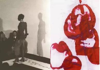
Martin Margiela was once on a show. In order to let the audience's eyes focus on the newly released Tabi shoes, Margiela asked the models to put on the Tabi split toe shoes and dip the soles with red paint. The white cotton cloth was used to spread on the T stage. The models left bright red footprints on the white cloth every step, and these white cotton cloth became another kind of art.

White highlights the essence of things, exposing the materials, ways, textures, and details of art works to everyone, and the courage to choose white is the most confident expression of their works.
RED
Red is strong, grand and aggressive. It is the most familiar and meaningful color for Chinese people. However, whether in our daily life or in our creation, the large-scale use of red is like an adventure.
Renaissance painter Titian once expressed his favor of red in this way. "A good painter only needs three colors: black, white, and red." The use of red is like a standard to test a good painter. In fact, red is also the earliest color in art history.
Altamira Cave still has murals in the late Paleolithic period. At that time, the creators used ochre, hematite and charcoal to paint. Through pigment dilution, they achieved different shades of red and light and shade contrast, drawing lifelike ancient creatures. This red color is also regarded as the beginning of art history.

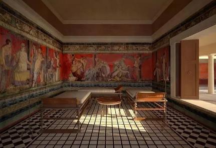
Later, the favorite color of ancient Roman artists was cinnabar. As one of the treasures of Pompeii, the Villa Item is famous for its exquisite frescoes on the red background. Painters use perspective to enhance the three-dimensional effect, while the red background further creates a sense of hierarchy in the plane.

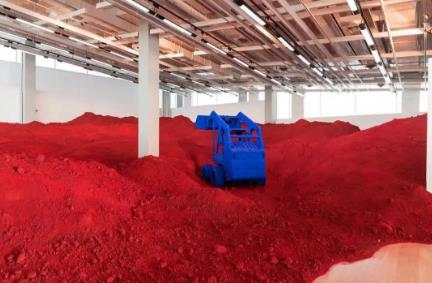
Among contemporary artists, Anish Kapoor from India loves red, and his works usually show the image of cubism. He makes good use of the combination of points, lines and surfaces to blend into the strong red, presenting an unusual visual impact.
This style is closely related to the artist's experience and multiple identity backgrounds. He prefers the exploration of the original texture of material, absorbs the external form of minimalism, uses the most concise visual language with strong red, and reveals the emotional symbol without doubt, but at the same time retains the ancient and mysterious oriental texture.
Red solid wax oil, towering sky mirror, invisible refracting cloud gate... His works usually attract people's attention with shocking senses, creating a mechanized and industrialized feeling, making his works full of fresh vitality.

Above, we use three common and easily overlooked colors [blue, white and red] as examples to help us explore the meaning of color from the creation of artists from all ages. In fact, each color has its own emotional appeal, and any work of art can not be separated from the contrast of color. Therefore, we can not discuss color without the work itself, but the color matching of the work set should select the most suitable elements from the theme, and then combine the color visual experience with materials, light and texture to sublimate the theme.
Recommended articles on color matching of more collections:
Art Design Collection for Studying Abroad _Color Contrast _Color's Influence on the Design of Collection for Studying Abroad
This article belongs to the original article of Natural Light International Art Education Team. Without permission, it cannot be reproduced commercially in any form. If it is found, it must be investigated for legal responsibility.


