As the highlight of the collection of overseas works of art and design, color plays an important role in the whole collection of art and design works. The collection presents not only your creativity, diversity and interdisciplinary, but also your first impression of color contrast visually. So how to make Study abroad in art design Is the collection full of visual sense? Let's take a look at the importance of color application in art design and the impact of color on the design of overseas art works.
The Influence of Color on the Collection of Overseas Art and Design Works
Color plays a vital role in both artistic creation and design works. Flexible use of color, combined with orderly color combination, can enhance the expressiveness and visual perception of works. In some specific cases, color can also lead to changes in people's mood and psychological feelings.
Any art and design discipline can not be separated from color, even the world we live in can not be separated from color. In addition to having an impact on our psychology, color will also have an impact on both the physical and physiological levels.
Art and Design Works Studying Abroad Concentrate on the Physical Level of Color
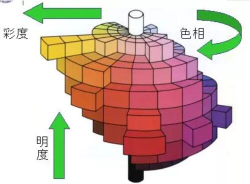
Art design is actually a series of physical properties of color. Purity, lightness and hue are the physical properties of color.
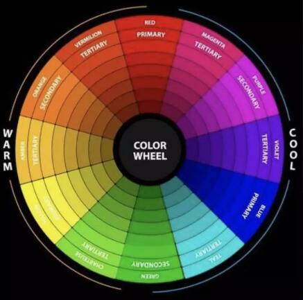
Hue -The appearance of color can also be understood as the name of color, that is, when we first see a color, it reflects the content, such as red, yellow, green, etc.
Brightness -It refers to the color feeling from light to dark between black and white. For the same color, from the visual sense point of view, the lighter is the higher lightness, and the darker is the lower lightness.
Purity -It is also called chroma, which is often referred to as saturation. It refers to the grayscale of the color, which is different from the black and white mentioned in the lightness. The lightness is just to brighten or darken the original color, while the purity is to mix other colors into the color.

How to make color contrast of art design overseas works? Through the above color space diagram, we can understand the relationship between the physical properties of color more clearly. The center of the circle is a cylinder whose gray value is decreasing from black to white. Around the cylinder is a 24 color hue ring. The hue rings on the same plane layer are all in the same brightness. The farther the color is from the center of the circle, the higher the purity, and the closer the color is to the center of the circle, the lower the saturation.
Although it is only physical, it is not difficult to find that color can give people some simple sensory feelings through comparison. The contrast between colors can help enhance the recognition of visual elements such as text, graphics, symbols, and increase readability. There are many forms of color contrast:
Comparison of cold and warm in the collection of overseas works of art design
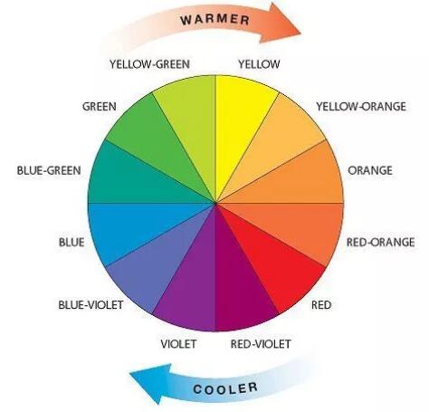
Everyone should be familiar with the cold and warm colors. Even foreign students without art foundation should be able to simply tell the cold and warm color division. Color is simply divided into cold and warm colors. For the division of cold and warm colors, in the hue ring, we generally divide them into yellow green and blue purple.

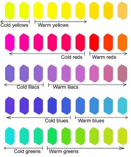
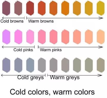
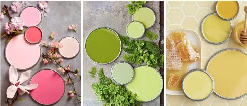
The cold and warm mentioned above are explained based on the preconditions of different color phases, but in fact, the increase or decrease of color saturation and lightness under the same color phase in the art design works will also affect the cold and warm of the same color phase. As shown in the figure below.
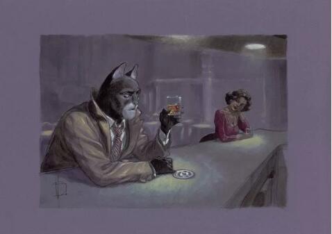
The influence of color on human feelings can be understood as: when we see a painting burning a fireplace, we tend to have a warm feeling psychologically, but when we see a picture of a street on a rainy day, we will subconsciously have a cold feeling.


Before and after comparison of art design overseas works
Bright and high saturation colors will give people a visual sense of progress, on the contrary, darker and deeper colors will give people a sense of retreat.
The most illustrative example is probably makeup. How can you make your face more three-dimensional? Take the nose for example. Add a darker shadow on both sides of the nose wing and bridge, and add a highlight in the middle of the bridge to make the nose appear three-dimensional and full.
Another example is the following hue ring. At first glance, does it have a deep three-dimensional sense in the middle?

Comparison of the size and weight of the collection of overseas art and design works
The contrast between the size and weight of colors should be well understood. We often say that dark color clothes are thin, while light color clothes are fat. This is the principle.
Similarly, the weight of colors can also be understood in clothing. The colors with lower lightness and purity will give people a calm and durable feeling, such as the beige coat in winter Morandi Clothing, etc.
The brighter and highly saturated colors will give people a sense of frivolity and expansion. The weight of color is mainly determined by lightness and purity. In the following contrast, the yellow color block is obviously different from the dark green color block in terms of lightness and saturation, but the overall yellow color appears more jumpy and divergent, but the dark green color is more calm.

Physiological aspect of color contrast in overseas art and design collections
On the physiological level, color is generally a more intuitive and real feeling, based on our personal experience or experience. The influence of color on human physiology will be reflected in the form of two associations and feelings, one is more obvious and specific, and the other is more abstract.
Specific physiological feelings of art design works abroad
The specific physiological feeling refers to a specific thing that we can think of intuitively through simple color or color. For example, when you see red, you will think of fire; When you see yellow, you will think of egg yolk or the sun; When you see pink, you think of strawberries; When you see green, you will think of forests, trees, grass, etc.

Abstract Physiological Feeling of the Collection of Art and Design Works Studied Abroad
When we see red, we will think of fire, which is just a very specific association and feeling. But sometimes, when we see a color, we will think of a more conceptual state or form. For example, when we watch a movie, when the picture turns black, people can't help but guess whether the following plot will become scary or dangerous, or will sad things happen?
In fact, this is a conceptual and broad feeling. When you see a certain color, you will think of specific emotions and states, which is the abstract physiological feeling of color.

The Psychological Level Influencing the Collection of Overseas Art and Design Works
The influence of color on people's psychological level actually originates from the physiological level, and we can regard the color feelings on the psychological level as the derivation of physiological abstract feelings.
Physiological abstract feelings refer to people's visual and psychological feelings of color, while psychological influences refer to the guidance and reflection of color on people's emotions and psychology. At this time, people are in a more passive state.
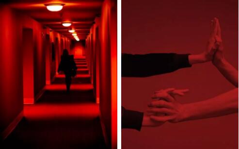
For example, red is easy to arouse people's excitement, excitement and tension, and it is easy to bring a sense of urgency and formality in the visual aspect of art design. Therefore, in the design, red is often used in some places that need special "vigilance", such as posters, instructions with warning significance, or book titles.
But in some specific occasions, such as the traditional Chinese consciousness and foreign Christmas, red is a very festive color.

Yellow, easy to bring bright, brilliant, brilliant, pleasant impression, will make people feel sweet and young. But sometimes, it is easy to cause some alerting conditioned reflex. For example, many road signs and street lines we see on the road are yellow.

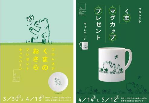
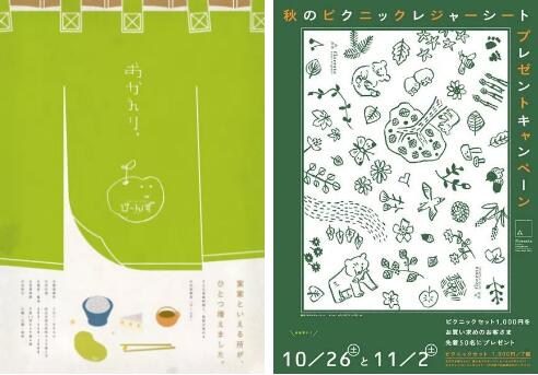
Green is the color of plants, so it will bring people the feeling of nature, health and environmental protection, and green itself also represents the richness, enrichment and hope. In the design, we often apply green to some gentle places that need to highlight positive significance, such as public welfare posters, such as landscape construction.


These three colors are not the only ones in the collection of overseas works of art and design. Each color can bring people different psychological feelings in any environment or scene. Grasping the physical, physiological and psychological characteristics and biases of different colors and using them in design can make your creation more high-quality.
For example, in poster design, the contrast between colors can highlight the visual elements and content that need to be highlighted; Combined with the influence of color on human psychology, we can skillfully use color to enhance the theme and content of creation.
For example, the following poster, when Shin Hai Shing's "5 cm per second" was played outdoors in the National Museum of Tokyo. The visual elements in it cover the classic scene of "5 cm per second". At the same time, in order to cater to the theme of "outdoor viewing" and the museum, the elements of stars are used on the posters. The whole poster is dark blue, which also gives people the aesthetic feeling of watching movies in the outdoor night sky.

In the design of some large spaces and signage systems, colors often need to be adjusted in line with the surrounding environment, such as the location, the audience around, and the need to be harmonious with the surrounding environment and highlight the design theme.
For another example, in film art design, designers need to adjust the overall color application according to the script and film content. What is the trend of the story told in the film? What auxiliary colors need to be used? Does the character need color to help plump? Do different scenes need color to help adjust the tone? These all need the reasonable use of color.
Let's take the classic film Godfather as an example. The whole series of films are almost dominated by dark brown and orange tones. Such dark and "dull" tones make the whole film shrouded in a repressive and slightly suffocating atmosphere, which also caters to the theme emotional keynote of the series of films, At the same time, it is also very suitable for the era background and social factors reflected in this film.
Color, which seems to be an unimportant element, affects many aspects of art design works. Our first impression of a thing and our psychological reaction to a work will be "disturbed" by color. At the same time, for art designers, learning to use color and grasping the psychological guidance of color will often make your art design collection more attractive.
More articles about the collection of artistic design works:
Design and creation works collection Morandi color system, color phase ring, complementary color, contrast color, similar color
Fashion Design Major Studying Abroad _ Portfolio Training _ Rendering Guide of Fashion Design Portfolio
This article belongs to the original article of Natural Light International Art Education Team. Without permission, it cannot be reproduced commercially in any form. If it is found, it must be investigated for legal responsibility.


