The composition of the collection of works is a part that everyone has always attached great importance to, but it also has an important auxiliary function of the work - words are often ignored. Even sometimes it's not that everyone doesn't pay attention to it. It's just that most students in other majors are not very clear about the role of characters except graphic design. They think that if the font is clear enough to play a supplementary role, it is enough. It doesn't take time to study. However, text is a design element with a high frequency in the collection of works. It can be found almost everywhere in the cover, title, text description, sketch and logo. That is to say, if the font design element of our collection is brilliant enough, it can become a key plus item in the collection of works. Today, let's talk about the application of words in the work collection, and tell us from the professional direction what are the key points worth mastering in font design?
How can the font design elements of the collection help the work?
01. From a macro perspective
For students applying this year, if you have not completed the design project, unless it is a part of the design work, you do not need to consider designing a group of fonts from scratch. Although the font with a personal style will be brilliant, it takes time and energy to do a good font design. At this stage, we still need to focus on the project work itself, and we must not be penny wise and pound foolish.
We should make it clear that the most important function of words is to convey information Composition design of works In the final stage of typesetting, the text should be as simple as possible, and the content that can be clearly displayed with images should be based on images.

Natural light student font design works
Because we have clear and accurate sketches and research in the early stage, the subsequent design is naturally evolved, and can be understood by the admissions officer without too many text descriptions. In addition, for most people's reading habits, when they see pictures and text at the same time, they will automatically choose pictures; Secondly, in the process of reviewing portfolios by overseas colleges and universities, there are a large number of applicants from all over the world, and the time reserved by the admissions officer for each portfolio will not be too long. In addition, our portfolio is spread on the computer in the form of page by page small pictures, so the admissions officer will roughly browse it, and will click to read it carefully if interested.
I believe that students with art examination experience can understand this. Therefore, if a large area of text appears under this review process, it will occupy the space for the presentation of visual works, and most importantly, it will also affect the overall aesthetic degree, missing the opportunity to obtain the first impression score of the admissions officer.
Therefore, in the process of typesetting, we students must not use the method of piling up words just because we gather the layout and see that the page is relatively empty. The purpose of using words in the work collection is to help us explain the design intent simply and clearly at the key turning point.
02. Focus of different majors
After clarifying the role of characters, we will specify the focus of characters application in combination with different professions and cases, and how to select fonts to better play a supporting role:
Department of Pure Art Illustration
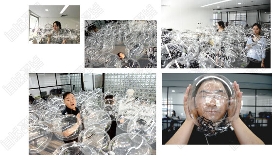
Text is very important for the collection of pure art works, because the theme and finished products of such works as installation, illustration and photography are relatively abstract, and the text serves as the explanation of the creators in the collection of works, so we must carefully elaborate the emotions reflected in the works.
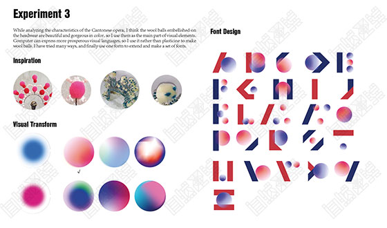
In addition, in terms of font selection, we can also deliberately choose fonts with the same tonality with the style of the work. Fonts have personalities, and different fonts will bring us different senses: for example, serif fonts in English will be more retro and emotional, while most sans serif fonts reflect simplicity and solemnity.

Natural light graphic design student works
Many other students will choose handwritten fonts, which will better reflect their personal style, but it is also very difficult. First, handwriting is uncontrollable, while the concentrated text description of works is the fundamental requirement for beauty and fluency, and students should be careful when time is not enough.
However, there is another exception: the interest and roughness of handwriting are very consistent with the style of the work itself, so handwriting can be used as a bonus item.
For example, a student of Natural Light who was enrolled in Huangyi's illustration major, the main items in her work collection are a group of children's illustrations drawn with colored pencils and a set of manual fabric atlases. Because of the sheer sense of handicraft in her work, her text descriptions and mindmap parts are all written in colored lead, and the text in her work collection looks more like a part of the work.
Digital media system
The digital media major is just the opposite of the pure art department, such as product design, industrial design, service design, etc. The works of these majors are more like a rational derivation process. We draw out the design results gradually through preliminary research, data analysis, subsequent model drawings, experimental tests, etc.
As long as the content is accurate and there is no missing, the pictures can already be seen at a glance. Therefore, we can try to simplify the text of this type of professional collection, mainly focusing on the background introduction and research.

Natural light student font design works
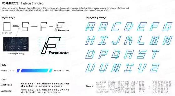
For font selection, our standard is easy to read, because for most digital media professional collections, the content of pictures is already very much. In order to avoid the lack of hierarchy in the overall layout, we can use key fonts to highlight, such as the title, the number of key keys and other parts to enlarge the font size, deepen the color, and the explanation part is as simple and concise as possible.
Zhiyi, a student of product design, has a project named SYMBOLIOSIS/Symbiosis in her works, which is about the new product design of Hui and Han people under the collision of two cultures. Therefore, she extracted many design elements symbolizing regional characteristics, such as silk, copper wire, wool felt, etc.
Because there are many elements involved, it is easy to be heavy in the visual presentation of the work collection. Therefore, she first reserved space for fonts by reducing pictures, and also used low saturation brown in the selection of fonts, and increased word spacing and line spacing. Therefore, the overall picture does not appear messy, but has a sense of space.
Architectural Space Department
We all know that most of the design projects of the architectural space specialty are relatively large, and the entire design process contains heavy information. How to arrange the design materials in an orderly manner within the limited pages has always been the focus of our typesetting, and the text plays an essential role in the series. recommend: Employment direction and prospect of building space
On the premise of being reasonable and beautiful, typesetting also needs to be magnified as much as possible, so we can try our best to choose pictures and words as aids for subsequent presentation of design results. In the architectural space specialty, the early research highlights logical thinking, so we can use words to elaborate.

Creative font design of natural light trainees
Rhythm is the key to the design of large pieces of characters. We can change the size, thickness and paragraphs of characters to highlight the key points according to the logic of thinking, but remember not to use jumping colors to avoid increasing the sense of visual fatigue.
In addition, for the data research part, we can also use the form of chart+text, which will show the research results more intuitively, and also simplify the text part. Pei, a student of natural light interior design, has selected four projects in her works, all of which belong to social and humanistic topics, with a huge amount of research work.
Therefore, in order to avoid the phenomenon that large pieces of text make it difficult to read, she combined many data charts, which not only achieved the function of clearly expressing information, but also alleviated the reading pressure; In order to make the text and data have a certain continuity, the text is aligned up and down with the chart, and the whole picture looks more exquisite.
Today we take three professional types as typical cases to analyze the font design elements of the collection. In fact, there are thousands of font choices, but for most students, the key is not what kind of font we should design, but how we grasp the principles of font selection.
The competition for art study abroad is increasing, and each student wants to show the best side as far as possible. Under this high level of competition, the handling of details is also the key point that we can not ignore. At the final stage of preparation of the collection, we also hope that you can cherish the results of the preparation for a long time, effectively use typesetting and writing, and maximize your advantages, Harvest the favor of colleges and universities with a perfect collection of works!
More recommendations on font design of collections:
Which typesetting font to choose for the collection? How large is the font used for composition of the collection?
This article belongs to the original article of Natural Light International Art Education Team. Without permission, it cannot be reproduced commercially in any form. If it is found, it must be investigated for legal responsibility.


