When it comes to leaving blank in the collection of works, it is usually considered as the most commonly used creation technique and space rule in graphic design. At the earliest, as a method in the creation of traditional works of art in China, leaving blank means that masters of traditional Chinese painting are good at using ink and wash to create close relationships in their works. Later, it became an aesthetic point of view and penetrated into literature, design, calligraphy, film and other aspects. It has already become an art and exists among various art forms. The density rule in the space composition represented by "leave blank" is applicable to any specialty. Because no matter whether the final results of our works are presented in a plane or in a three-dimensional space, students need to show our control over space, shape and emotion unreservedly. Which works can also be used in interaction, architecture and film? Today, we will talk about how to reasonably use "blank" to deal with the spatial relationship in the works with these three professional examples.
How can the blank space in the portfolio be applied to the interaction, architecture and film majors?
Interaction design: leave blank ≠ simple
The use of "leaving blank" in the field of graphic design is obvious to all of us. It can help us improve the sense of space in graphic works, and let the audience's eyes fall on the information we want to be concerned about. As a derivative of visual art under the development of new media, interaction design also applies to the role of "leaving blank".
However, unlike graphic works, interaction design pays more attention to the interaction between people and products. For a graphic work, visual elements are what we can see at the first sight, but the presentation of interactive works is usually concentrated on a mobile phone interface or web page that can be changed. It requires interaction with people to display different functions.
Therefore, according to the usual logic of "white space" - putting the most important information in the visual focus, many people may think that the white space in interaction design is to make the interface as simple as possible, remove fancy decorations and unnecessary information, and highlight the most important functions.

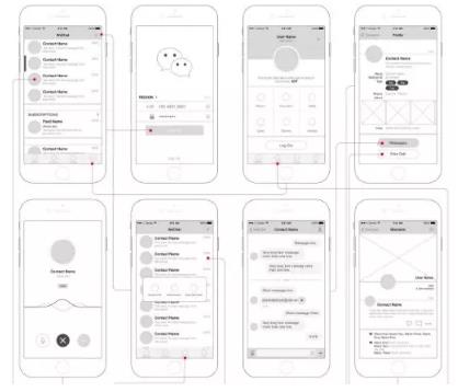
WeChat - seemingly simple interface design with very strict logic support
Such a view is actually limited. First of all, for the interaction design portfolio, interface design is a very important way to show creative points and deepen the visual impression, and "good-looking" is of course also important; Secondly, the blank space of eliminating complexity and keeping simplicity not only cannot play the role of promoting eye movement path, but also loses the most important "interactivity" in interaction design.
What is an effective "blank" in interface design?
First of all, we should make it clear that a successful interface can not be just a stack of functions. We can treat the interface as an indoor space. We need to cooperate with "residents" to do appropriate soft decoration, and various functional homes can not only be placed in the middle of the living room, but also need to be reasonably distributed. The treatment of leaving blank is to reserve a way for people's activities, Guide the audience to find what they need, so as to have a really strong relationship with the audience.
Architectural design: less is more
Less is more was put forward by Mies van der Rohe, a master of modernist architecture. Although we usually do not recommend students to adopt a unified style in the creation of the collection of works, the "less is more" proposed here refers to the functionalist aesthetic thought reflected in the architecture through appropriate blank spaces.

Modernist architectural style proposed by Bauhaus College
We usually say that architecture is the best unity of art and technology. This also shows that function is the foundation of architecture, and the shape of architecture also depends on structure. We don't want to leave structure and function to create forms, so what we say in architectural design is not the separation and reorganization of architectural space, but the control of the overall planning and design through the control of architectural functions.
In architectural design, most students usually have large specifications for project site selection. It is very important to leave blank on how to make the most effective planning and highlight our key points in a limited time. But the blank here does not mean that we can give up the part, but that we can ensure the relaxation of the space on the basis of the overall planning.
The establishment of relaxation can come from "primitive". An excellent architectural design must be integrated with the external environment. We can also make good use of the original elements of natural landscape or materials in the process of "leaving blank". Of course, the premise is harmony with the overall style. On the one hand, it can reduce our workload, and on the other hand, it can show our ability to control the whole.
When it comes to the relationship between architecture and environment, leaving blank is also the simplest and most effective way to create scenes. Some students will choose the architectural design with humanistic themes. The distinctive feature of such themes is that they pay great attention to the feelings brought by space. In fact, the sense of atmosphere is very critical, and the right blank space can help us to reasonably layout and broaden the level of space, leaving room for daydreaming.
Film major: Nothing out of nothing
In fact, the blank space in the movie is very easy to understand. The movie is the way that the director tells stories. The story telling needs rhythm, pause, and fluctuation. Only by doing this can it be an attractive story. These are precisely the significance of leaving blank for film creation.
In the movie language, blank space can be called empty field or empty mirror, which means that there are no characters in the movie screen, only scenes or short blank shots. It has many functions, such as controlling the rhythm, rendering emotions, changing scenes, and so on. When it comes to making good use of empty mirrors, we often think of Director Hou Xiaoxian.

Director Hou Xiaoxian - stills of The Assassin Nie Yinniang
When we watch Hou Xiaoxian's films, we often feel that the pace is very slow because of the use of empty mirrors. We often have time to jump out of the plot to think about stories outside the camera. But this way will not break the structure of the story, but will bring us a stronger emotional resonance. This is precisely because the "blank" in the film created a lot of virtual space outside the screen.

Director Hou Xiaoxian - stills of The Assassin Nie Yinniang
For our classmates, "leaving blank" as a style may be difficult to implement in operation. Because commercial film is the work of a team, our professional film collection is more about students' control of the whole, or the presentation of the script story.
We can regard blank space as a technique to control the rhythm. Whether it is the creation, shooting or later stage of the script, we need to consciously make ups and downs and contrast according to the development of the plot, create "blank space" of emotions, and provide the audience with freedom of interpretation.
Can the blank space in the portfolio also be used in the interaction, architecture and film majors? Above, we only give examples of the application of the concept of "white space" in three majors, but white space can be used in all majors, which also requires us to combine the characteristics of each major in the creation process of the portfolio, learn to deal with the contrast between different elements in the works, and make good use of white space to express the "sense of space". In addition, "leaving blank" has a more direct expression in the composition of the collection. Because the page requirements of the collection are limited, and there are many contents to be presented, many students will want to show the complete design process as far as possible, and will arrange the limited space very "full". In fact, too much content will increase the visual pressure of the audience.
What we need to do is to ensure the complete logic, both in terms of content and typesetting, we need to handle the blank, such as the control of font, the arrangement of pictures, the selection of colors, and even in terms of content, we can selectively arrange priorities, so as to help the admissions officer to maintain visual comfort as much as possible in the review process, And pay attention to the key points emphasized in the design project, which reflects our advantages.
At the end, I also want to tell you that leaving blank in the collection of works is not an excuse for us to be lazy or a way of opportunism. It is just an artistic concept, which can be interpreted from techniques, aesthetics, logic and other ways. Its fundamental purpose is to hope that students in the collection of works must pay attention to the control of the overall vision, so that the primary and secondary are clear, efficient An infectious collection of works!
Natural light shares more topics for you:
Movie poster design tips can bring more inspiration to your art collection creation
What should be displayed in the collection of architectural space? AA, UCL case analysis
Interactive Design Work Experience in the UK - Interactive Design Works Collection Training Tutor's Overseas Work Experience Sharing
This article belongs to the original article of Natural Light International Art Education Team. Without permission, it cannot be reproduced commercially in any form. If it is found, it must be investigated for legal responsibility.


