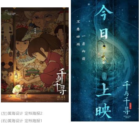
Recently, there are many re released films, and the most surprising one is "Spirited Away", which is a warm childhood. Chinese designers have produced a group of super beautiful posters for it, and they have received international acclaim! As a branch of poster design, movie posters are different from commercial posters, public welfare posters and cultural posters. Movie posters are the essence of a movie. Many times we go to see a movie because of posters. Because of the poster design full of artistic sense, the movie itself probably won't be too bad. Today, I will take you to learn some tips about movie poster design, hoping to bring more inspiration to your art collection creation.

Tips on Movie Poster Design:
When a film is introduced to other countries, the film posters will be designed with different effects. It is not only necessary to adapt the copywriting to the language of different countries to make changes, but also to re design the layout of the layout and reshape the background of the posters. It is these tiny design elements that form the basis of film poster design. Study abroad and Studying abroad in film major Students get up!
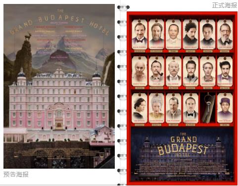
Most films have preview posters and formal posters, and the design styles of these two posters can be completely different. The preview poster will try to keep the mystery of the movie as much as possible, and will not disclose the relevant information and content of the movie to the audience. The design of notice posters is mainly based on picture effects, supplemented by words, and has a strong guiding purpose.
The official posters are mostly published in the form of "movie resumes", combining picture elements with text elements. It basically includes the film name, release date, important roles such as directors and actors, production units, creative synthesis, etc. Some will also have the movie plot and other text information.

Budapest Hotel Movie Poster
1. Visual Art in the Early Stage of Movie Posters
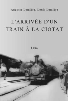
The Train Arrives, released on December 28, 1895, is the earliest movie poster in the world. At that time, the elements of the film poster design were limited, and the classic black and white colors were mostly used. The text elements in the poster were also simple and clear. The poster design of "The Train Arrives at the Station" has established the initial style of the movie poster, but it does not have more artistry.

Picture source Douban
Since then, the design of movie posters has undergone rapid changes with the development of the film industry. Early film poster design was basically completed by hand painting. They gradually had color and structure on paper, more like a work of art with unique charm.
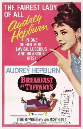
Breakfast at Tiffany's is one of the classics of early film poster design. Hand painting creates a visual effect of retro comics for movie posters. This retro style is very particular about color matching, and the use of high saturation color was a popular design element at that time.

With the rise of computer technology, the visual elements that can be applied in film poster design are more diversified, adding many new combinations for poster design.
2. Design Comparison of Movie Posters
Through the film poster design of "1950s-1960s", we can find that even for films with different themes, the poster design will have similarities. For example, the modeling design of the characters in the posters, the style of color matching, and the handling methods of copywriting elements. These small design details, which are easy to be ignored by us, can make the movie poster produce different visual effects after adopting different design ideas.
The same design elements produce different effects
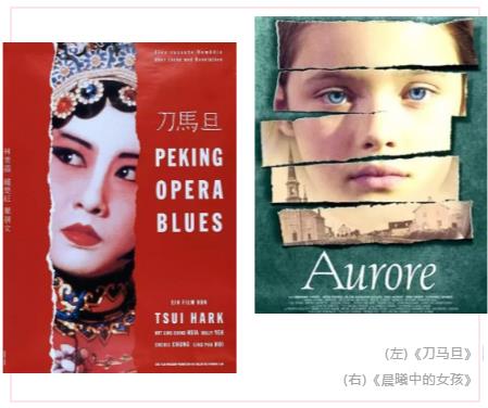
The style trend of poster design shaped by the same element can evolve into multiple results. Collage art is the most valuable art technique in design. It has a wide range of applications, and there are many quantitative changes. Here are two posters of different styles.

The poster of "Dao Ma Dan" adopts the artistic technique of vertical collage, with 80s Hong Kong style font and rich vermilion. Each element reflects the design concept of Chinese style. The face in the collage gap not only represents the main character in the film, but also implies the precious traditional Chinese culture - Beijing Opera, which frequently appears in the film.
The Girl in the Dawn constructs an incomplete head of the heroine by means of horizontal collage. The dark green background tone is a metaphor for the sense of oppression that you want to release, which reflects the dark side of the film. From the design of the film poster, it can be seen intuitively that "Girl in the Dawn" tells an unequal story.
The same design elements can be flexibly used in different theme movies, which can play a different role and create a unique texture for each movie poster.
Part shapes the whole
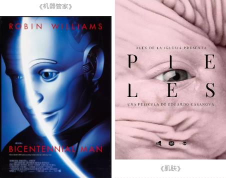
Local features also appear in most poster designs. This form establishes the style of the film by emphasizing the characteristics of the characters, while setting off the mystery of the whole film.
The poster of "Machine Housekeeper" directly uses the image of "robot" in the film. The halo and red font used in the design elements are standard configuration of science fiction films, which can clearly show the film content related to science fiction at a glance.

The overall tone of Skin is mostly pink and purple. The implication of pink is not only the romance that is finally cured, but also the calm of self acceptance. The poster design of Skin uses a large amount of pink, which closely adheres to the theme of the film while giving a warm and soft feeling. The fonts with different sizes and vertical and horizontal distinctions make the text primary and secondary. The pleated texture in the poster pattern is opposite to the name of the movie and the content expressed in the movie.
The relationship between movie posters and movies is not limited to the selection of background patterns of posters, but can also be strengthened by embellishing each design element.
Reasonable layout of elements
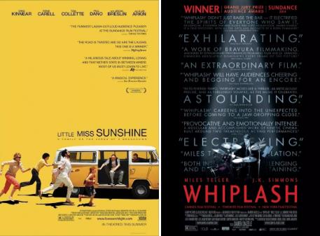
The carefully deliberated copy elements and color composition are important elements of the movie poster. Their reasonable layout and layout can determine the "breathing sense" of the poster, control and adjust the overall atmosphere and theme style of the poster.

The poster of Little Miss Sunshine unifies the text on the right side, leaving a sense of gap with the pictures at the bottom, which conforms to the reading habits and increases the reading fluency; The bright yellow tone corresponds to the word "sunshine" in the film title. However, the crowded layout of the copywriting and the repressed black tone of the poster background in Burst Drummer echo the process of self breakthrough expressed in the film.
There are many design combinations of movie posters. In addition to the points mentioned above, we also commonly see movie posters depicting characters, movie posters designed in combination with movie scenes, movie posters in the form of embroidery, animation or cartoon, etc. Using different permutations and combinations of design elements, the design of movie posters will take on a new look.
Movie posters play an important role in promoting movies. A newly launched film is not only limited to the film poster, a common design method, but also the cover design of the original album of the film. Next, let's take a look at the comparison between the two.
3. Movie Poster and Original Album Cover
The cover design of the movie soundtrack album is often later than the movie poster, and the online time is mostly after the movie is released. The cover size ratio of the movie soundtrack album is 1:1. Because of the small area and many elements, the cover of a movie soundtrack album is more difficult to layout than a movie poster.
The blending of movie posters and original album covers is mostly on the picture. The connection between them is basically the LOGO of the main visual elements.

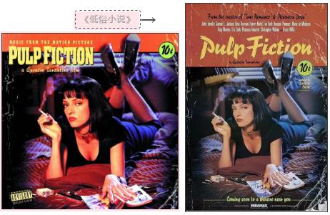
From the cover of the original album of the movie "Pulp Fiction", we can find that the elements related to the copywriting have been simplified, and the visual impact of the picture has been strengthened. By adjusting the contrast, saturation, and hue of the image, the overall effect of the image will be very different without switching.
By comparison, we found that in the design of the movie poster of "Pulp Fiction", words can be a foil to the pictures, and their combination plays a role in the transmission of the film content. In the cover of the film soundtrack album, various elements become simple and refined, and words become one of the leading elements to attract the public.

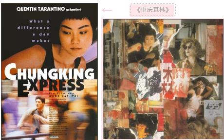
Chongqing Forest is the opposite. The movie poster of Chongqing Forest is from the clear outline on the top half to the illusion on the bottom half, deepening the contrast of the picture itself, and the visual effect of the pattern is bright and strong. The cover of the original album of the film is completed by collage art, and the words of "Chongqing Forest" are also buried in trivial pictures with similar colors.
Visual transformation often appears in movie posters, which are used in the movie poster of Chongqing Forest and the cover design of the original album. Posters are a comparison of different effects in subjective vision. Each collage and superimposed picture element in the cover of the original album is combined with the film content, full of interest and vitality.

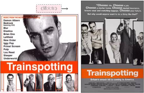
The difference between the film poster of Train Guessing and the original album cover of the film lies in the deconstruction and utilization of design elements. The pattern elements in the movie poster of Train Guessing are re used in the design of the original album cover of the movie by "re deconstructing the layout" to get a new background pattern.
The design of the cover of the original album of the movie Train Guessing lacks more details, but different methods are used to deal with the pattern elements when the picture is fused. The change of local structure makes the whole picture take on a new look.
4. Behind the Design of Movie Posters
Perhaps you are familiar with the works of famous directors such as Quentin and Wong Kar wai and their creative styles. But their success depends on those movie posters full of countless details and interests. These posters hide the story behind the film: the director's lens, the designer's hard work, the actors' emotions and smiles in their eyebrows
A movie without a soul cannot support the beautiful shell of a movie poster. Excellent film poster design is not only a visual art enjoyment, but also a way to see the story and plot of the film in the poster. I don't know whether today's introduction will help your art collection creation. If you have other questions, please come to natural light for free advice.
Natural light shares more topics for you:
Layout of art works: how to achieve independent layout of mature works
Graphic design collection layout, poster layout knowledge in Marvel movie posters worth learning
This article belongs to the original article of Natural Light International Art Education Team. Without permission, it cannot be reproduced commercially in any form. If it is found, it must be investigated for legal responsibility.


