What is the composition standard of the collection? Easy to read or interesting? Art pays attention to aesthetics, and the layout of art works is often the most intuitive and comprehensive first aesthetic impression we give to admissions officers. In order to obtain the precious impression points of dream school, everyone has made every effort to study typesetting. Different aesthetic standards have different tendencies towards typesetting. So, what is the composition standard of the collection?
Among all the styles and preferences, there are two more extreme typographical tendencies of the collection: one is to seek beauty and fun, and to leave a deep visual impression on the admissions officer by selecting beautiful pictures, simplifying text, creative typography, etc; The other is to simplify the complexity and pursue extremely simple and easy to read typesetting. In order to show the school the progress of their ideas, many of the contents are put into the work collection in strict accordance with the creative ideas without being cut. These two tendencies will form two completely different styles in specific practice, and there will also be corresponding drawbacks. For example, the pursuit of good looks will inevitably give up some "ugly" sketches and process maps, leading to incomplete; In pursuit of integrity, it is difficult to distinguish the primary and secondary. In order to make a competitive collection of works studying abroad, what kind of composition standard should we choose?
What is the standard for composition of works?
1. Adults don't make choices, only focus on
First of all, we should make clear what the collection of overseas art works is. What are its characteristics compared with other forms of art collections and manuals such as corporate vi manuals, artists' personal work collections, job search work collections, etc.:
1. There is strict page number control (American colleges and universities pay special attention to it);
2. Have clear professional guidance;
3. Contains several different projects;
4. The most important thing is that it has a strong purpose - to be recognized by the target university
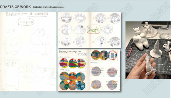
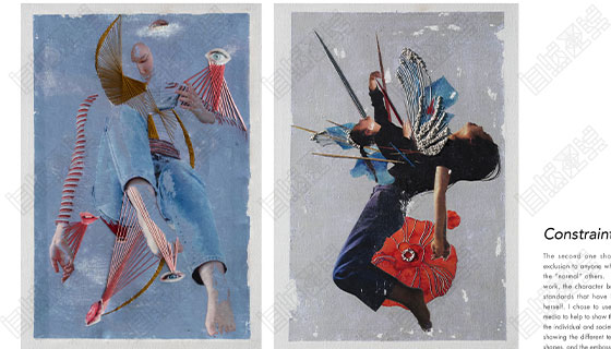
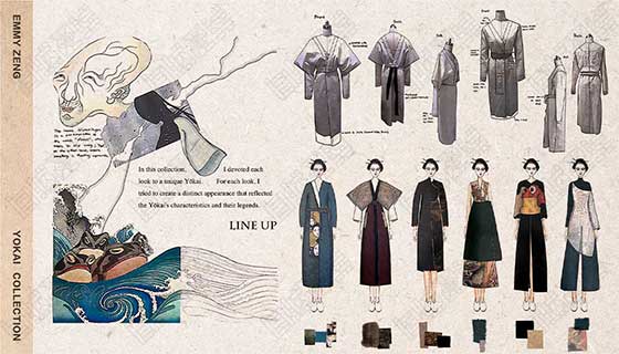
The following figure is a comparison of the composition of the same work of Natural Light You in the postgraduate entrance examination work collection and the art study abroad work collection:


Therefore, our goal is to show as many different capabilities and potentials as possible within the limited number of pages, which requires us to develop a clear layout plan, reasonably arrange each page, and achieve both focus and consistency with the work creation and design ideas.
2. Classic routine - total score
The composition class in primary school has taught us that "total score" is always the clearest structure, and the same can be applied to layout planning. Typography should be considered not only after the completion of the project, but also throughout our entire production cycle.
The first "general" should be placed before our production. The first step is to understand the layout requirements of the target university, including the number of pages, format, upload method, etc.
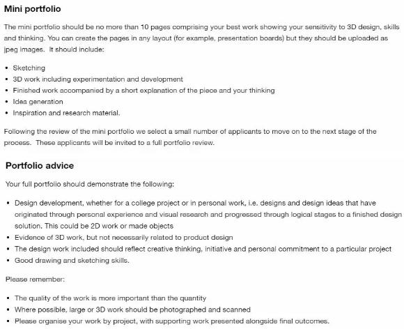
Taking the product design of UAL London University of the Arts as an example, they require students to prepare two sets of works. The first set of MINI version has no more than 10 pages, and must accurately highlight the advantages of students. The full version can be submitted only after the first MINI version has passed the review.
The content requirements of the two collections are also slightly different. The MINI version emphasizes the results, while the full version requires to show the design concept and design development process, which requires us to plan in advance when typesetting, focus on the creation process in the project production process, and control the overall direction.

Clear requirements also define the overall layout. Next, we need to determine the style orientation of the composition of the collection. Like our project works, typesetting also needs a unified style. Now on the Internet, there are many typesetting guides or templates, most of which are distinctive in style and good-looking in format.
However, we do not recommend students to use ready-made templates in their work. As the first impression of students by the admissions officer, the collection of works will actually pay more attention to the reflection of students' personal characteristics. Secondly, the format also needs to be changed according to the content of each person's design project, and these assessment points actually start from the cover and directory.
The typesetting style of Yiran's work collection is very personal. Yiran is a student majoring in illustration. In this year's application season, she received five offers, including Huangyi and UAL. Her work collection includes six projects, mostly in the form of colored lead, handmade fabrics, clay, etc.

The layout of her collection of works also retains this original and manual style, which is very unified from the font, color and finished pictures. The overall style looks like another set of works in the collection.

After the establishment of the preliminary plan, we will proceed to the next step - "dividing". In addition to focusing on visual effects, the most important thing in a work collection is the logical order. Most colleges and universities require that the number of pages in a work collection be controlled within 20 pages, while a set of work collections contains 4-6 project works, each of which roughly occupies 3-5 pages. How to properly place the research, construction process and design drawings in this limited page is what we need to analyze.
When it comes to the specific content layout, many students believe that the most easy to read typesetting method is to follow the order of the timeline. In fact, the admissions officers usually have rich experience in reviewing drafts, and they are already very familiar with the students' design process, which also means that too much step-by-step typesetting is likely to cause their aesthetic fatigue.
In order to attract the attention of the admissions officer, each individual project should focus on the theme and the ability we most want to reflect. The whole typesetting sequence presents a progressive relationship, so that the admissions officer can follow our ideas and see a growth process.
In addition, on the basis of controlling the overall thinking logic, each page can also have different expression points. For example, in Collection Research We hope to show our strong research ability and rigorous thinking ability, and the corresponding layout can also be shown in an orderly order. The part of sketch or mindmap is relatively easy to reflect the creativity and personal style of students. We can try some creative typesetting methods in this page and enrich the content to maximize our advantages and catch the attention of the admissions officer.

The design project of Biwei, a student of natural light clothing design, based on the inspiration of the Maritime Silk Road
But I would like to add that many students may think that the Chinese translation of sketch is "sketch", which means that sketch can be very rough and wild. This idea is very, very dangerous. Because for art schools, every page of your works, every detail in every page, is the focus of their review.
The same is true of sketch. If you want the admissions officer to understand your idea quickly and directly in a short time, you must first ensure that the sketch map is "high-definition", "code free" and "accurate"! The content that can be expressed with images should never be included in the "design description". In addition, a logical and high-precision sketch can also help you in the process of the project and avoid some irreversible mistakes in the later period.
For example, in the architectural design, from the early sketch to the later model making, and even the project landing, this is a tedious process with a large amount of work. During this period, if your model ability is strong and the sketch is accurate, then your landing and design draft will be almost the same, but if there is any "carelessness", It is likely that the final landing building will not meet your expectations.
The last "master" of the composition of the collection is placed after all projects are completed. We should return to the whole, treat the collection as a complete visual work, and adjust the order of each item. As we often emphasize, the collection of works has a preparation cycle, which can be as short as 2 or 3 months, or even 15 months or more in the long run. In this cycle, the completion of the collection of works is gradually increasing, and the students' professional ability and comprehensive ability are also constantly improving. The collection of You students' works I used as an example is the best example for comparison. If you sort out the collection of works according to the time clue, the admissions officer will reject you when he sees the first work. You should know that the work collection reviewed by the admissions officers of overseas art schools is very similar to the teacher's marking in the domestic art examination.
We interviewed RISD Rhode Island School of Design Jennifer, the admissions consultant, has simulated the review of the work collection of the admissions officer with us. Almost all the work collections submitted by American art schools passed the slideroom. When the admissions officer first saw the works in the slideroom, your work collection was spread on the computer screen page by page in the form of small pictures. The admissions officer roughly browsed it before opening it. In this process, the time for each admissions officer to review the collection of works is also very short. If your first project or cover is not brilliant enough, you will have missed the dream school. So we must not arrange them in the order of creation, but try to choose the most attractive projects first.
In view of the gap between different projects, we also try to weaken it in the arrangement, and select targeted pictures. For example, the effect picture of a project is not perfect, but the creation form is unique. We also try to avoid the important and take the light in the page performance, and grasp the balance. Especially for cross major students, we don't need to pursue integrity all the time, and take every part as the focus of presentation, because we may be weak in basic skills compared with students in this major, and how to reflect our potential and enthusiasm for this major is the key point we need to consider.
In addition, students should try to avoid too many repetition and trivial things. There must be a reason for the placement of each picture and sentence. The "sense of space" is also a very important composition standard in the reading experience. The simplified and relaxed form of expression will also give the admissions officer a better impression.
Conclusion:
What is the composition standard of the collection? Easy to read, good-looking and interesting are not two opposite styles. An excellent collection of works must have both. Compared with the "good-looking" format, we should pursue a "meaningful" collection of works. After all, the admissions officer has such rich experience in reviewing manuscripts, and the probability that we can accurately catch their aesthetic tendencies is relatively small. In contrast, it is much more practical to win with content. In addition, we should not be overly superstitious about the composition standard of the collection of works. Good composition is timely, and there are some corresponding changes in different majors and colleges. For example, we said that "pictures are more attractive than words", but for students majoring in pure art and photography, their works are relatively subjective, If there is no written explanation, it is easy to cause the admissions officer not to understand, so the written explanation is also an important part.
Natural light shares more topics for you:
How to conduct collection research? Research methods we must master
What should we do in the bottleneck period of portfolio creation? Listen to this general design optimization skill lesson
Font design of graphic design works collection, what are the font skills in typesetting of graphic design works collection
This article belongs to the original article of Natural Light International Art Education Team. Without permission, it cannot be reproduced commercially in any form. If it is found, it must be investigated for legal responsibility.


