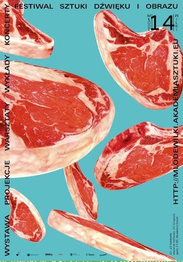
Today brings you the concept of nuclear energy in the production of graphic design works: Hierarchy visual hierarchy, hierarchy! Let your graphic design collection say Say Bye! How to make a collection of graphic design works? The training instructor of the graphic design portfolio for studying in Natural Light Art will show you step by step!
Many times we are attracted by the Poster on the street
Or be caught by the layout of magazines
I always think it's because it's simply "beautiful"
But actually Graphic design for art study abroad This matter
A lot of little tricks
For example, the collection of graphic design for overseas students mentioned before is "left blank"
And what we are going to bring to you today
Hierarchy
How to make a collection of graphic design works?
Collection of Graphic Design Works Hierarchy in Hierarchy
Level is a big concept for the layout of the collection of graphic design overseas students' works, but it is also very important, in fact, it is also very easy to master.
As one of the key words of design methodology, Hierarchy plays a decisive role in the study of art graphic design. The meaning of the word refers to "visual hierarchy". At the same time, sister articles will be launched: 《 Graphic design collection production: information transmission/visual rhythm beauty/composition/personal ability is indispensable 》 You must remember to come back and see!

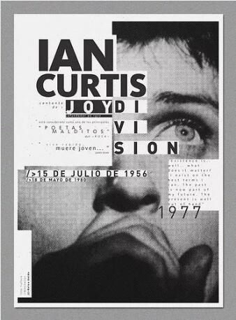
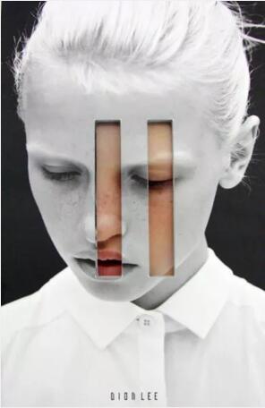
(Poster From Pinterest)
Today, we will introduce how to improve your collection of graphic design works for overseas students by improving the level. When layers are reflected in vision, there will be contrast, which is the most prominent expression technique in artistic beauty that tends to conflict with each other.
It displays the nature and characteristics of the things described in the works in sharp contrast and direct contrast. It shows this through the other, compares and contrasts with each other, and from the differences presented by the contrast, it achieves the performance of concentration, simplicity, and twists and turns 。
Through this method, the performance and characteristics of the product can be highlighted or prompted more clearly, giving consumers a profound visual experience. As a common and effective means of expression, it can be said that all arts benefit from the comparative means of expression.

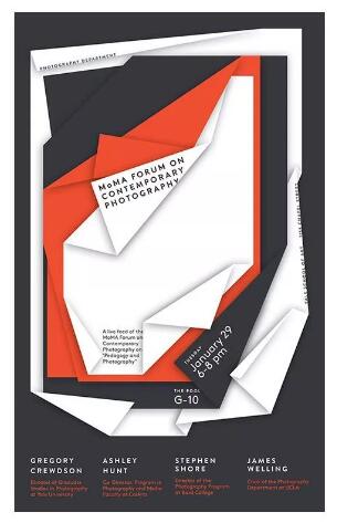
(Poster From Pinterest)
Even if you are not familiar with this concept, you must have seen many different levels of graphic design portfolio production and layout.
Newspapers have very clear levels: Main title, subtitle and body. This is a typical three-tier arrangement. Many prints and online designs still use this type of typesetting.
Newspapers from the early to the middle of the 20th century
Collection of Foreign Graphic Design Works
It provides us with clear examples:

Although our main title no longer has to use 6-inch large font to attract readers' attention, the above figure is a good reference: Different levels can better show readers what is important information.
Readers can grasp the overall layout at a glance, so that they can find the information they need more quickly.
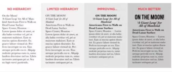
Improving readability and usability is one of the most important benefits of this typesetting. If we do not follow a certain level of emission, we will lose focus like the first two examples in the following figure. Readers will find it difficult to distinguish between the levels in the picture, and cannot find the primary and secondary.

The first three examples of graphic design portfolio composition can increase readability by changing font, changing font size, increasing line spacing, changing style, and increasing the distance between different areas.
How to arrange graphic design works reasonably?
So how can we create a reasonable level in the design of graphic design works?
After many experiments, it has been proved that it is a good way to design three levels of graphic design works.
Primary level:
Generally speaking, your first level should be the most important of all your information; It should be the most prominent element in your graphic design portfolio design.

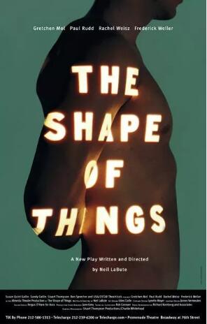
(Poster From Pinterest)
Secondary:
Secondary elements can organize your graphic design portfolio into several different parts or combine similar contents. Secondary information cannot be as eye-catching as primary information, but it can clearly guide readers to find the information they need.

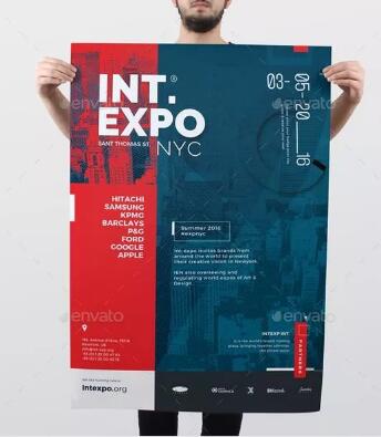
(Poster From Pinterest)
Level 3:
For graphic design works with more text content, three-level text is the most important part of the whole design. It can be long or short, the whole article, or a few sentences, or a brief introduction, but the most important thing is to make it easy to read, because usually the text size at this level is small.

(Poster From Pinterest)
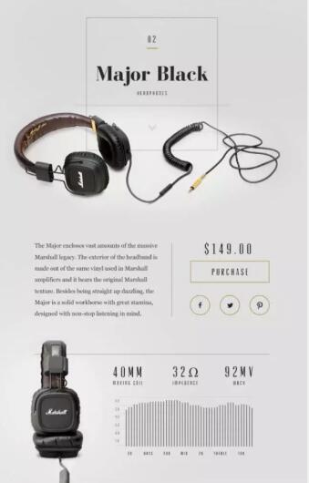
The following figure is a very simple product promotion. Although it is simple, it is divided into at least three different levels.
1. The name of the product is the primary content;
2. Price is secondary content;
3. The product introduction is a three-level content.
Note that although the text in the product introduction is small, the line spacing is large, so it will not be difficult to identify.

Dribbble/Sam Thibault for Handsome
In fact, you have many ways to arrange and combine. Many methods may only be small details, but as Charles Eames, an influential American designer, said: "Details are not just details, details make design".
Let's take a look at some details we can do in terms of hierarchy!
How to design the layout level of graphic design works?
01. Adjust font size
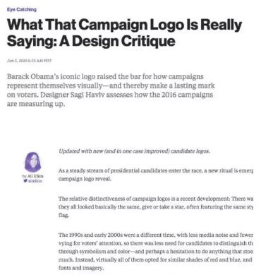
Changing the font size is the simplest way to distinguish different levels of graphic design works. For three-level typesetting, the text of the first level information is usually the largest. With the increase of the secondary level of information, the text becomes smaller and smaller, and reaches the smallest text at the third level.
Our usual reading habits are from left to right and from top to bottom, so the structure of upper and lower levels is the most acceptable to readers. This is a very common typesetting for books, magazines, web pages, etc.

Bloomberg Politics
Remember, changing levels is all about making your most important information stand out. Whether the information is a name, the title of an article or blog, the promotion discount on the advertisement, etc., if you can use the largest font in this part, it will surely attract the most attention of others.
For example, the discounted price of $97 in the figure below is much higher than other information. It also uses bright red to emphasize.

Dribbble/Flavius Nechita
02. Select a group of different fonts
Think again about the example of the newspaper we saw earlier. Does it use both bold sans serif font and italic sans serif font for comparison?
Although the font contrast of our graphic design works should not be so strong, it is absolutely the key to successful font combination.
Over the years, the combination of serif and sans serif fonts has been used by many designers. This classic combination is a good start for any design. Even if only the font different from other parts is used in the main text, it will also create a very good effect.

Dribbble/Filip Slovကek
Remember not to choose too many fonts. Too many fonts will only make your graphic design collection crowded. For most graphic design collections, 2-3 fonts are enough. When selecting a font, pay attention to whether the font matches the content.
For example, you can't use fashionable and illegible fonts in important information. Or use conjoined fonts that are tiring to read in large sections of text. Other fonts are difficult to recognize after being turned down.

(Poster From Pinterest)
03. Try different font styles and widths
Many fonts are available in different styles and thicknesses. Different styles include italics, small letters, reduced or expanded fonts. Width refers to the different thicknesses of a font. If your font is thin, medium, thick, and bold, this is different width.
These elements help you have more choices in graphic design portfolio design. The newsletter in the following figure is an example. All sans serif fonts use the same font size, but use different widths. Bold
Newsletter makes the title more eye-catching.

Dribbble/Whitney for Switch.co
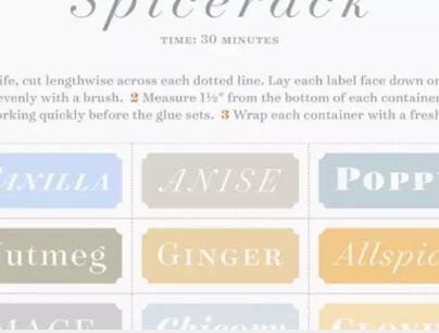
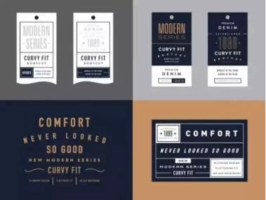
The labels in the following figure all use different font styles and widths.

Dribbble/Hoefler&Co.
04. Add some colors
Just like style and width, color can also make your text more prominent. Since colors usually have their own meanings, it is necessary to ensure that the correct color is in the right place when selecting.
The following figure shows the invitation letter of a sustainable coffee company. The design of this creative graphic design works collection uses natural and simple colors to set off the company's development philosophy and activity theme.

Dribbble/Krista Engler
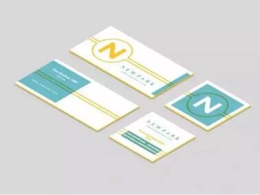
In the same way, the collision of contrast colors can attract more attention. The business card in the following figure uses a conspicuous yellow and blue color scheme to attract attention.
05. Pay attention to the interval
When designing, the spacing of words, including line spacing and word spacing, can make the design of a clear, concise and readable creative graphic design collection crowded and incomprehensible.

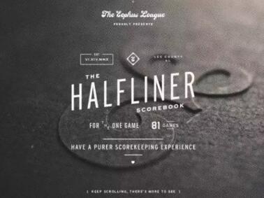
For example, in the following example, sufficient spacing makes the design in the following figure clear and readable, even the text on the small label can be seen clearly.

If enough space is reserved for graphic design works, we will soon know how to read and extract information. On the contrary, if there is not enough space left, we need to narrow our eyes and carefully identify these words. Or I don't want to see this design at all, because this collection of graphic designers is too messy 。
The following presentation uses enough space, disperses the text, and adds some blank elements to avoid the problem of insufficient space. At the same time, the color plates and geometric figures make each plate orderly.

Dribbble/Rob Luke for Skookum Digital Works
06. Pay attention to the interval
Spacing not only refers to the separation of elements, but also includes the close proximity of similar elements. Reducing the distance between two similar blocks will also help readers process information.
Especially for the graphic design works of overseas students with many characters, the key to maintain the overall layout balance is to close similar characters.

Dribbble/Elysse Ricci
07. Play in various directions
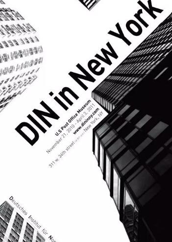
Sometimes the parallel text may not achieve the effect you want. At this time, it is better to try to rotate the text, or tilt and twist it, which can separate this part of the text from other text and attract more attention.

Dribbble/Bethany Heck
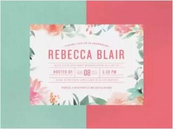
When creating a hierarchy, you will probably use all or most of the methods mentioned above, just like the invitation letter of the premarital party below.
This collection of graphic design works Different font sizes, different fonts, different colors, increased spacing, reduced spacing and text deformation are used to create a complete layered design 。

Dribbble/Casey Cooke
Proper use of these methods can make your design more attractive and reader friendly.
So next time you do graphic design for overseas students, try these methods mentioned above.

(Poster From Pinterest)
Return to the Hierarchy of Graphic Design Works
Western art colleges pay more attention to the logic power of creative graphic design collection design in the process of student training and assessment. To sum up, Hierarchy is very important!
The accuracy and refinement of the visual hierarchy often determine whether your graphic design can clearly and directly express the meaning you want to express, and all these factors determine what color, font, symbol and shape you should use 。

(Poster From Pinterest)
On the contrary, if the visual hierarchy is not accurate and clear, then the main information that needs to be conveyed by graphic design for studying abroad in art will lose some, or even cause wrong interpretation by the audience.
When a Graphic Design 'Portfolio is presented to others, it may only take a few seconds for viewers to glance at it. In these seconds, it is not important that it is colorful, gorgeous and cool.

(Poster From Pinterest)
The important thing is that you must hope that others can see the elements you want to convey the most at the first time. This also determines whether your collection of graphic design works for art study abroad is worth others stopping and looking at more, or is it just a common product to throw aside.
Therefore, it is worth taking some time to understand the design hierarchy of visual effects before the layout design of graphic design works.
Graphic design portfolio case display


Graphic Artist Designer Portfolio Trainer
Miss Lin
Natural Light Portfolio Trainer
Boston University Graphic Design
Mr. Lin graduated from Sichuan University with a bachelor's degree. When applying for master's degree, he was successively: Rochester Institute of Technology , Boston University (half scholarship), Preet College of Arts and other schools; During the undergraduate period, my personal design works have participated in many exhibitions at home and abroad and won prizes; During the postgraduate period, GPA 3.75/4, art works were collected by the school art museum, and awarded excellent graduates of Boston University; During the university and graduate period, he has served IKEA, SCTG and other large design institutions and companies at home and abroad.
Mr. Lin is good at creative visual design and practical graphic design. In teaching, he is good at grasping students' hobbies and expertise to open up students' design ideas, so that students can find their own design ideas; Mr. Lin is very familiar with the teaching mode and application process in the United States, and can control the requirements and rhythm of the collection of works. He hopes that he can guide the students studying in natural light art to create a unique collection of works through his rich experience in studying abroad, practical experience, and unique insights and understanding of graphic design.
Proficient courses: graphic design, installation art
More graphic design for art study abroad:
Introduction to the Application of Graphic Design Major for Studying in American Arts
Graphic Design for Studying Abroad in Art | Blank space is one of the indispensable elements in graphic design
This article belongs to the original article of Natural Light International Art Education Team. Without permission, it cannot be reproduced commercially in any form. If it is found, it must be investigated for legal responsibility.


