In the information age of multimedia, big data and interdisciplinary, as international students, especially those studying art majors, are paying attention to their own majors, and the collection of works should try data visualization. Through cross-border data visualization training, visualized international students can get an offer early.
As the most closely related art major with multiple disciplines
—— Data Visualization (Data Design)
Data Visualization
Once again, let the art profession
Up to one The height of scientific research
In addition to the position represented by the experimental data itself
The designer acts as a communicator
Different designers have different expression styles
Large data scale style
Follow the style of rational analysis
Those who follow beauty, interesting style, etc
What exactly is data visualization?
Data visualization Is deemed to be associated with Visual communication Modern concepts with the same meaning.
In order to convey information clearly and effectively, data visualization is used Statistical graph, chart, information chart And other tools will also be used Dots, lines or bars encode digital data to visually convey quantitative information.

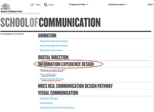
Information Design, Royal Academy of Arts
Effective visualization can help users analyze and reason data and evidence . It makes complex data easier to understand and use. Data design is a promising profession. The world's top schools all have this major, which is Visual Communication The direction of the subdivision.

London University of the Arts Data Design (MA)
Data visualization is both an art and a science. Some people think it is a branch of descriptive statistics, but others think that the artistry makes the research data better displayed.
In order to help students better understand the significance and future prospects of "data visualization", we might as well enjoy the works of some artists at home and abroad to see what advantages this major has and what we can learn from it
project 1:Facebook reactions
Facebook reactions
data visualization/infographic
Hanna Piotrowska(Dyrcz)
This work is for Hanna Piotrowska, an information designer, to provide ERGO Houston Group with information Annual report of the web concept Visualization of complex data designed.
This kind of visualization is related to the network in the social media environment. It shows the activities of users on the ERGO Hestia Facebook page.
Analysis method:
The black dots on the horizontal axis represent all the posts on each page in 2016, in chronological order. Each white dot represents a person who responds by "liking" it or selecting one of the five available expressions. This reaction is expressed by the connection between a person and a post. The size of the dot depends on the number of such connections, so it represents the popularity of an article or a person's activities.

Visualize scientific research data
These symbols are then rearranged into interrelated nodes and outward radiating lines according to the data. Hanna Piotrowska tried different permutations and combinations of these parameters, and finally focused on "time", and arranged the articles in chronological order.
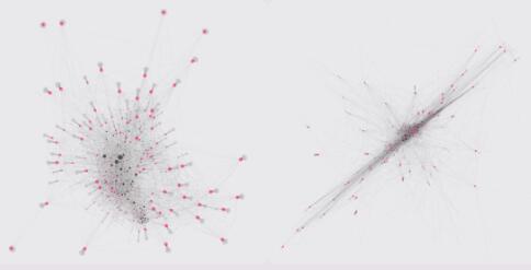
We can also see the following two unused versions of Hanna Piotrowska, which were created under the influence of gravity - the more links a node has, the more attractive it is to other nodes.

Two alternative schemes for Hanna Piotrowska's works
Materialization - book design:

Picture album of Hanna Piotrowska's works
It was printed and displayed as the visual effect image of ERGO Asia annual report. The following is the display on the inside page of this atlas.
Project 2: Spring Festival Gala on Neptune

This is a very interesting topic.
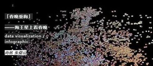
The Spring Festival Gala Reconstruction is a colorful picture of the party videos we have known for 20 years, and it won the AIGA New Voice Award.

Xiang Fan's "Reconstruction of the Spring Festival Gala"
This work was created by Professor Xiang Fan and software engineer Zhu Shunshan from the Department of Visual Communication, Academy of Fine Arts, Tsinghua University.
Professor Xiang Fan is committed to Research on Digital Visual Design , on The possibility of exploring visual art language between high and low technology and new and old media Participate in the social data visualization project as a senior researcher of the MIT New Media Action Laboratory.

Xiang Fan's "Reconstruction of the Spring Festival Gala"
Speaking of the inspiration of this project, Professor Xiang Fan said that he often lived with his parents after returning to China during the Spring Festival. One headache is to watch the Spring Festival Gala for more than five hours in addition to having dinner with them. And every year you feel the same.
I wonder if the students who study abroad for data visualization training have this feeling. Is the performance and stage setting of the Spring Festival Gala the same every year? Professor Xiang Fan hopes to see the Spring Festival Gala in a more bird's-eye view. Get a macro view and look again.
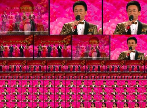
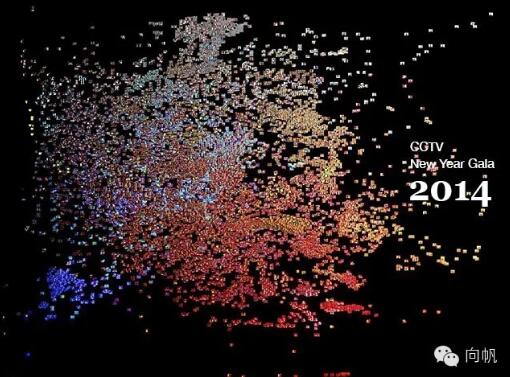
She directed a video of the Spring Festival Gala on the computer, and then used pieces of code to turn every frame of video into a picture. Finally, the 33 year old Spring Festival Gala video screenshots were arranged in order to get the picture above.
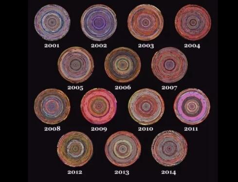
The project was finally completed in 2012. From 2012 on the right to 1983 on the left, all the 30 years of vision of the Chinese Spring Festival Gala are presented here. The large bluish purple area in the upper left corner is a manual animation of that year, If we look closely, we can see that the Spring Festival Gala is becoming more and more popular.
If we take a closer look, we will see more information.
We will see that the change of the Spring Festival Gala is actually the change of China's TV technology . For example, editing speed, screen, live lights, etc. are changing. There are many factors behind this.

Xiang Fan's "Spring Festival Gala Reconstruction" picture comes from the Internet
When we break the year and arrange every second according to the color, this is the color of the Spring Festival Gala.
project 3:Cell Theory
Cell Theory
data visualization/
infographic
Maria Bublik
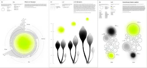
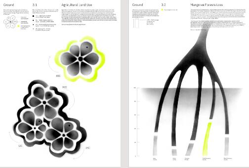
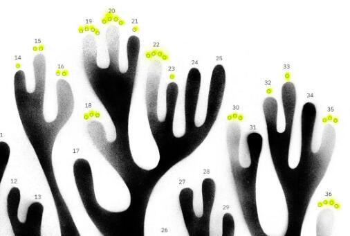
The above is designed by Maria Bublik, a data designer, and is called Scientific Cell Theory Visual works of environmental survey data. The content is related to the system, relationship and metaphor of all species.

Maria Bublik's Works (Part 1)
The research data is divided into three parts. Committed to the study of human invasion of wild nature. The shape of the figure is inspired by the shape and structure of various microorganisms. The printed matter adopts hybrid technology, combining manual production and vector printing.

Maria Bublik's Works (Parts 2 and 3)
The research results and the effectiveness of this set of data will not be discussed for the time being.
Taking the visual effect of the first part as an example, Maria Bublik, the designer, designed a simple picture and simple graphics, with the relationship between color depth changes and the size of circular images, It is easy to relate it to the parameter "concentration".

Work by Maria Bublik
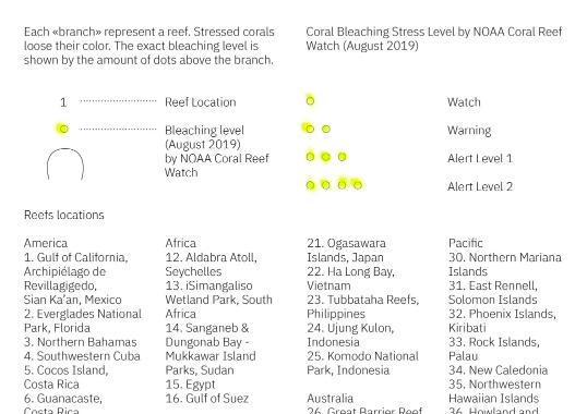
In addition to the first part we just talked about, that is, about air (including data visualization on air pollution), the visualization images of research data in the second and third parts are shown in the figure above.

Work by Maria Bublik
One is about plastic pollution, coral reef bleaching and abnormal marine climate; The other is about agricultural land, mangrove loss, endangered wild species and other global issues.

Maria Bublik's work - research results
It is as simple as the first part, and the second part is as simple as the third part It is very rigorous and clear, and the audience can intuitively feel the results of the data trend without being disturbed by images.
Materialization - book design:
Data visualization mainly aims to convey and communicate information clearly and effectively by means of graphical means.
However, this does not mean that data visualization must make the audience confused in order to achieve its functional purpose, or become extremely complex in order to look colorful.
Origin of data visualization field It can be traced back to computer graphics in the early 1950s. At that time, people used computers to create the first graphs and charts. Since then, data visualization has been a concept in continuous evolution, and its boundary has been expanding;

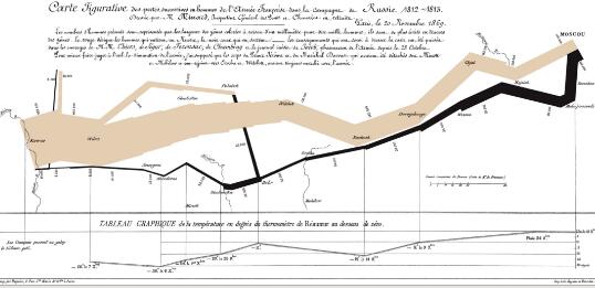
Charles Joseph Minard, French engineer
An information map drawn in 1861 about the invasion of Russia by the Napoleonic Empire
The increase in the amount of data generated by Internet activities and the increase in the number of sensors in the environment are called "big data" or the Internet of Things Processing, analyzing and communicating these data is an ethical and analytical challenge for data visualization.
Today's summary
The purpose of data visualization is to effectively convey ideas and concepts, so as to strive to achieve the aesthetic form and functionality go hand in hand. Gain insight into fairly complex data sets by intuitively communicating key information.
However, designers sometimes can't grasp the balance between design and function, putting the cart before the horse. The created images are flashy, which not only fail to achieve the purpose of communication, but also lose the role of communication information.
Data visualization is closely related to information graphics, information visualization, scientific visualization and statistical graphics. The term "data visualization" unifies the mature scientific visualization field with the younger information visualization field.
At present, the big data of the whole industry is used to capture the needs of users. Students studying abroad for data visualization training should not ignore that data visualization professionals are extremely critical and relatively scarce.
Interdisciplinary art media coaching, going deep into the world's leading digital media city
Master of Graphic Design Visualization, Loughborough University
This article belongs to the original article of Natural Light International Art Education Team. Without permission, it cannot be reproduced commercially in any form. If it is found, it must be investigated for legal responsibility.


