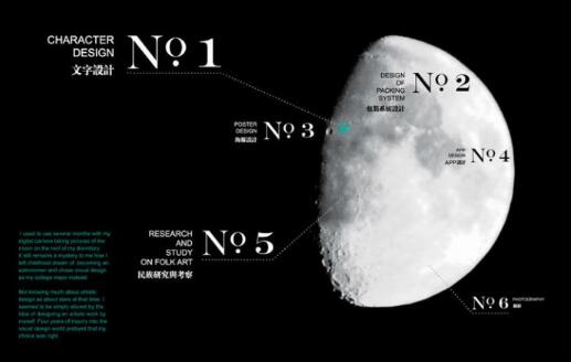
Collection of Architectural Works Applied by American Postgraduates The thing that must be prepared is that the layout of the architectural works collection must be concise. I believe I still have a say in this respect, Architectural Works It is aimed at students applying for architecture department and some art departments, Collection of Architecture Studied Abroad It is one of the most important materials for application. well Coaching of architectural works It can cover your score.
about Studying abroad in architecture Some schools do not require a collection of architectural design works, such as the University of California; Some university collections require a fixed size or format, such as Cornell University; Some universities have no rigid requirements for the collection of architectural works, but require the number of works (generally about 20 works in universities), such as Syracuse University.
Architectural Works of American Graduate Students
1. Preparation of architectural works:
A. How many pages does the collection of architectural works need to be made? You should start from the first year of senior high school, because you can't draw dozens of paintings in a short time, which is a process of accumulation.
B. The building model should be done when it is needed. It is suggested that you can do it in the summer vacation of Senior 2, with plenty of time.
C. Sketch, not necessarily a plaster figure, can be an object in your life, your parents, your pets. Draw when you can. D. Essays, very important, reflect your style and focus. You can go to sketch and draw cartoons... Only by drawing more can we select the best and have style.
E. Photography can be taken at any time. But don't steal pictures. Teachers are not fools.

2. The contents of the architectural works collection should be distinctive:
A. Please open your mind. In the case that the American Graduate University of Architecture does not require that your works must be paintings, your works can be models, calligraphy, ceramics, sculpture, photography, or even origami.
B. The model (building model or three-dimensional composition model) is of great significance to the application. Because it proves that you have contacted college courses one step earlier than your peers. "One of the main tasks of freshmen is to make models." My model lasted more than a week. It is a library. Thousands of twigs on it were cut and pasted by me and my friends and relatives. There is no easy job in the world. Everyone should be prepared.
C. Architectural works do not have to be professional, but must have characteristics. You don't have to draw very good architectural drawings, or design a house drawing. What the American Graduate University of Architecture wants to see is your creativity and your development potential. If you can do well, you will not be a high school student. So, you can put some creative paintings, your essays, cartoons, or small handicrafts, so that the university can see your thoughts. For example, when I applied for the collection of architectural works of Syracuse University, I made a paper model of the School of Architecture of Syracuse University. When I opened the collection, the model stood up.
D. It may not be a building, but it must be related. For example, you can draw some three-dimensional structures, block splicing, or cut a fruit and draw its different side elevations.
E. Students with ability can try CAD drawing, Sketch up, and 3D MAX.
F. After selecting the materials, you can start to see what you have to show, make a list and classify them, which is easier to show. I think the display sequence should first have a very professional model, so that people can see your professionalism and creativity, and then grasp some structures (most closely related to architecture). Next are sketches, sketches, oil paintings and the like (technical display), and finally your other small works and photography works. The following are all expressions of the vitality of your thinking.
G. The home page should have your basic information, birthday, and name. Open the directory!!! Without a directory, you will be dazzled. (Each block can have a sub directory).
H. A little description can be added next to the works to indicate the creative inspiration. The creation date shall be indicated. (preferably in recent years)
3. The layout of architectural works is simple:
A. The composition of architectural works is very, very important. It took me at least two weeks to set up my architectural works, which has been greatly changed four times. Beautiful typesetting can make readers happy and can also show the primary and secondary relationship between materials at a glance.
B. When composing architectural works, let your mind jump. Don't stick to traditional typesetting. Typesetting can be centered, tiled, left/right centered, or faded background... These are the common methods I summarized myself. But the most important three points are: leave blank, be concise, and do not focus on the middle.
You can see the layout of the magazine, home magazine or architecture magazine "UED is the best", but there are also differences, because sometimes the magazine conveys the trend and concept, which can be controlled at a glance. What we need to do is to let people look at the pictures one by one.
C. Do not use PS when composing architectural works! Use Illustrator. The reason is that when you use PS for typesetting, the definition of the image will change as you insert the image. Therefore, the final resolution is much lower than the commonly used 300 resolution, and the print will be even rougher. Compared with PS, illustrator insertion is a "double" of an image, a hyperlink that looks like an image. In this way, when zooming in and out, the resolution of the image itself will not change because it needs to adapt to the inserted page. Note: Press and hold shift to deform without changing the aspect ratio
D. The materials of PS works should be detailed. When it's time to cut out pictures, don't try to be convenient. Be careful. Control the contrast.
E. The font of architectural works is clear. Don't use this font if you think it looks good. The font of the collection should not be flashy, such as handwriting or cursive. Because the purpose of the text of the collection is to help explain, not to dominate. The clearer the font, the better.
Other fonts can be used for the cover of the architectural work collection, but they should conform to the overall style. The best project is to go Overseas Art Training Improve the background of practical projects!
F. The layout and page number design of architectural works are exquisite. Page number is an important tool to guide readers. It must be conspicuous and exquisite. Details decide everything!!
G. Have your own style. My father said that because we are Chinese, we can properly join some Chinese style. It will be exotic. So my final cover inspiration is the window of Suzhou garden. I also thought about making a collection of works with Facebook as the main line.
H. All the styles and inspirations of the master's works of architecture are obtained after a lot of reading and learning from other people's works. I once saw a person make a cover with a photographic eclipse as a clue, and I thought it was great.

4. Printing of architectural works:
A. The picture should be exported from Illustrator when printing finally. Use a drawing board, JEPG format, resolution 8/9, RGB color, and draw a clipping line "commonly known as bloodletting". The clipping line should be smaller than the picture itself, because you should allow bookbinders to make mistakes within 5mm.
B. The binding format and paper grade need to be carefully judged. Generally speaking, the butterfly suit is the most expensive and best "around 180", because it can make the architectural works set open completely in tiles without seams, which is most suitable for students with tiles in typesetting. The paper grade, not necessarily the thickest, looks flashy. Generally, 120g coated paper is used, "the interlayer between butterfly fittings should not be too thick, and special instructions should be given". Coated paper will shine, so students who have a small tendency to freshen or pursue paper feel can choose other paper types. When I print Cover paper, I use thick paper, which should be guided by the principle that "truth is as big as the text title". When I print forms, I use a paper that looks unimpressive, but feels thin and smooth. It is thinner than copper plate and has texture. I forget the name. It is low-key and luxurious. It looks silly and can not bear pondering. It is also one of the most expensive papers.
The above is for graduate students applying for American architecture. The summary of how to make application preparation and typesetting for the architectural portfolio, and how to do each step of the portfolio typesetting coaching have told everyone. It should be completed under the guidance of the architectural works training teacher.
Related to overseas works of architectural design:
Cornell University Architectural Design _ Studying Abroad _ Application, reported by Cornell University Architecture undergraduate offer
Studying abroad in architectural design, the tutor of architectural works took us to see the recycled buildings on the ruins
This article belongs to the original article of Natural Light International Art Education Team. Without permission, it cannot be reproduced commercially in any form. If it is found, it must be investigated for legal responsibility.


