Collection of Art Studied Abroad It is an important part of the application, accounting for a large proportion. not a few Art study applicants We only focus on the excellence of the selected content, but ignore the composition of the collection. In fact, typesetting is a concentrated reflection of a student's overall thinking, good Collection of Art Studied Abroad Instead of just piling words and pictures together, all information should be sorted and filtered to their proper positions. This is not only to make the audience comfortable, but also to show your creative ideas clearly. Is Portfolio training Our students should pay attention.

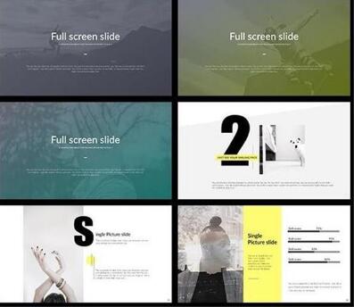
Example of Portfolio Layout
From the above, it is not difficult to see the importance of the composition of the collection, but due to the diversity of its types, many students will be confused by the choice of styles. Here are some basic typography types for you to adjust according to your own needs and styles.

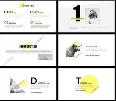
Example of Portfolio Layout
Recommended composition type of portfolio training :
1. Left and right split type
The layout is divided into two parts: left and right. The two areas can form a balance. You can also use strong and weak contrast to interlace the text and make the layout more harmonious. The left and right split typesetting is very fresh, and the text column brings the overall style into a simple texture.
2. Upper and lower split type
The layout is divided into two parts, the number of pictures is unlimited, showing a dynamic atmosphere, which can be written in columns or summarized in a centralized way. The upper and lower segmentation is easy to operate for vertical layout, because the equal analysis of each plate does not need to arrange locations for content grading.
3. Vertical typesetting
The pictures and words are arranged in columns in proportion, which conforms to the reading habits of ordinary viewers and produces a rigorous and rational aesthetic feeling.
4. Axial type
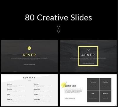
The layout is arranged horizontally or vertically, and the text is placed symmetrically on the top, bottom or left and right of the layout. Symmetry and balance are most commonly used in format design. They have certain advantages in creating a sense of stability and order, but at the same time, they tend to make admissions officers have a visual sense of vulgarity and lack of surprises.

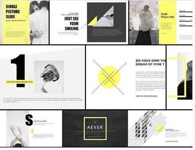
Example of Portfolio Layout
5. Allover
It is generally used for commercial pictures. Images are full of or close to full of pictures. Generally, images with lighter and brighter colors can also be slightly blurred. The text is arranged on the image, which can be placed in four corners or in the middle. Dark color chart light color text, light color chart dark color text.
6. Paratactic type
Repeat the selected pictures in the same size and different positions to achieve the contrast effect of the whole layout. Through both connected and different elements, the picture can have a relative sense of symmetry, while making the picture more flexible, vivid, varied, and more modern design.
7. Curved and inclined type
The pictures and words are arranged in a curved form, or the pictures are arranged in a slanted way, so that the layout shows an unstable visual sense and a sense of rhythm as a whole.
8. Freeform
Irregular typesetting can make the layout lively and lively, but it is necessary to avoid excessive, scattered and incomplete typesetting. The free version often causes the problem of over unification and lack of change. The image size should be appropriately scaled to increase the contrast between its strengths and weaknesses.

Several suggestions for portfolio training
1. Adjust the proportion of each part
After a rough arrangement of the content, you should go to each page or chapter to see whether the area of the part and the whole is comfortable, and there should be no too abrupt parts, unless you want to fully emphasize it in the work.
2. Leave appropriate blank
This is a creative habit of foreign creators. They prefer to leave a reasonable blank and care about this gentle expression, rather than let the content forcefully "fill" other people's thinking.
3. More interesting layout
If you are confident in your understanding of layout, you can skillfully use geometric elements such as curves and diagonal lines to change the composition, making the layout more vivid and humorous. Bold composition can not only enhance the page impression, but also play the role of finishing touch.
Collection layout It's an art work, Natural light collection training Art teachers advocate Collection of Art Studied Abroad You don't need to arrange all your collections of works, but you need to arrange some of the ideas that reflect your creativity or your ideas to solve problems Collection of Art Studied Abroad . More Portfolio training Questions are welcome Natural light art study abroad 。
Natural light art education article recommendation:
Parsons Pure Art Study Abroad, Natural Light Pure Art Collection Training
Works collection training and guidance, illustration design considerations for studying abroad
This article belongs to the original article of Natural Light International Art Education Team. Without permission, it cannot be reproduced commercially in any form. If it is found, it must be investigated for legal responsibility.


