What do you need to know about studying web design? The website is one of the main platforms for us to obtain information. The experience of the computer side website is not inferior to that of mobile software and APP. Having some website design specifications and understanding of the principles of website operation may inspire some students to become WUI designers in the future. Today we will take a good look at some design cases. What does an excellent website look like? Let's see it!
Major in web design for overseas students:
Website design is functional design, and web page design is the layout of specific pages after basic functional development.
Simplicity+color contrast, full marks for visual experience
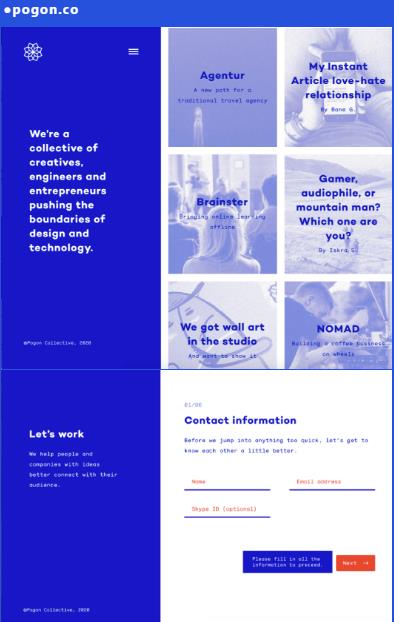
Pogon is an office integrating creativity, design, brand planning, online marketing and other services, including brand creation, website construction, online shopping platform, social network, and mobile applications. They focus on creating the best user experience for customer groups.

This kind of work makes Pogon's founders and technicians familiar with designing their own online home pages. In the easy and simple layout and vision, in addition to the white text and some necessary case color matching, the paranoid and bold almost all choose blue, and the slightly dynamic sidebar is extremely smooth to use.
Character+dynamic effect, full score for interesting experience
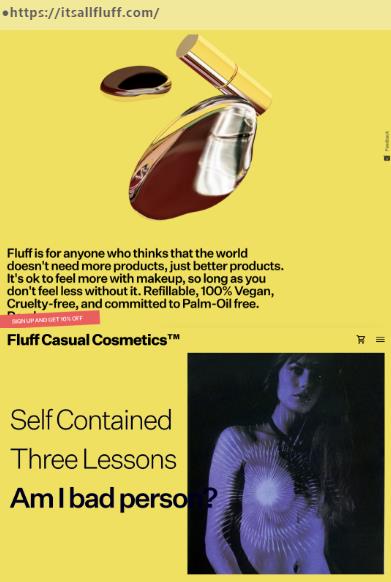
The second page is the official home page of the brand Fluff. Fluff is a company that produces and sells cosmetics. Erika Geraerts, the founder, believes that today's young people are very dependent on cosmetics. If they don't make up, they will feel that they are less likely to go out.

The young Fluff homepage uses bright and enthusiastic yellow, which is highly saturated and meets the aesthetic needs of young users. Fluff's sense of sunshine confidence and avant-garde Fluff aesthetics are reflected on the screen, which aims to convey that the product functions will not cover everyone's own beauty. "The future of beauty is more than make up".
Blank+fluorescent, full score for contrast experience
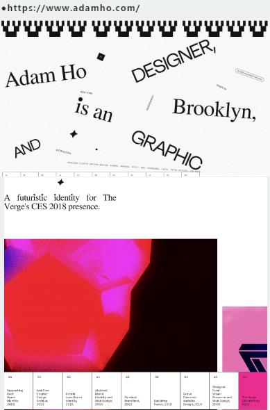
Adam Ho is an independent designer in Brooklyn, New York, focusing on the intersection of brand identity, art guidance and interactive design. Adam Ho Portfolio is his personal work website.

Font+retro color, nostalgic experience full marks
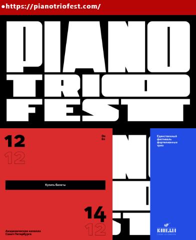
This is the publicity website of St. Petersburg Piano Festival. A very important visual feature is the bold design and color selection of the text appearance. Red, white and blue constitute the main colors of the website. The idea of black as the background comes from the national flag. Musicians come from Switzerland, France and Russia, respectively. These colors are the national flags of these countries.

The designer first put the schedule on the first page, and at the same time let people familiar with the background information of the artist. The design of this web page avoids splitting the content into multiple pages, so that users can make smooth transitions. Without additional HTTP requests, they can click the names of artists to learn about their information. recommend: Is Graphic Design Good for Studying Abroad for Employment
Serif+advanced grey, full marks for visual experience
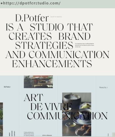
D. The homepage of Potfer Studio, a design studio located in southern France and Paris, cooperates with local and national brands, involving design, creativity and brand related work in the fields of culture, luxury goods, art of life, etc.

Daisy, the founder, has cooperated with Chanel, Swatch Group, Four Seasons and other brands for nearly ten years in terms of Realms of communication and digital strategy. She created her own brand D with strong aesthetic taste Potfer Studio, facing new challenges and meaningful cooperation, is eager to achieve outstanding performance.
Text+dynamic effect, full marks for visual experience
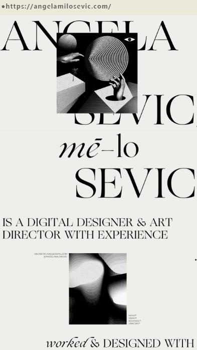
Designer Angela Milosevic's personal website, with brands including ADOBE, AIGA, APPLE, Nike, FACEBOOK, etc.

At the same time, Angela Milosevic is also a digital illustrator. Its website is very similar to the style and color matching of its illustration works. The most interesting thing about the website is a fault wind interaction. When users drag the mouse, countless layers of images will appear.
Composition+retro red, full marks for visual experience
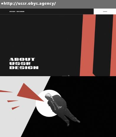
Science popularization website, the Soviet design yearbook is amazing. From color matching to composition, the visual experience with a strong flavor of the socialist camp in the last century, compared with the colorful design world today, the ingenious idea of interactive animation in the web pages instantly made the heritage of Soviet design appear on the paper.

Soviet design is a priceless heritage left by a big country. It is supremacy, constructivism and avant-garde. Although it is an artistic heritage, among all kinds of design styles nowadays, German design famous for Bauhaus, the minimalist style of Northern Europe, and Japanese design with the same minimalist but oriental Zen are unique.
Many excellent web design works not only have outstanding layout design, but also have something worth learning in dynamic effect, interaction and experience. If you are willing to speculate carefully, you will also find that each page has its own personality, many details of processing skills and content matching strategy. There are many sources of inspiration for design, not only to understand others' visual design, but also to carefully experience the actual effect. Compared with sporadic design works, these websites from famous design institutions are more valuable for website products born under different needs.
More about studying abroad in web graphic design:
How to apply creative graphics in graphic design works?
How to Practice Point, Line and Plane of Visual Graphic Design Works Collection
This article belongs to the original article of Natural Light International Art Education Team. Without permission, it cannot be reproduced commercially in any form. If it is found, it must be investigated for legal responsibility.


