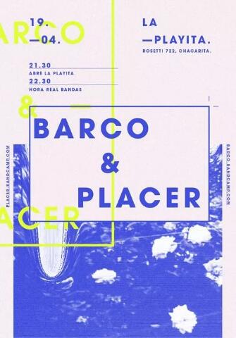
What design mistakes should be avoided in the centralized font design of graphic design works? The font design of graphic design study abroad has become a trend, whether for personality or to avoid infringement, and many designers have to design every word. Next, the Natural Light Art Study Abroad Editor summarizes the design mistakes that need to be avoided in the creative font design of the graphic design study abroad works, hoping to help everyone.
What design mistakes should be avoided in the centralized font design of graphic design works?
Not all fonts need to be designed
Nowadays, font design has become a trend, and many people must design every word. But in fact, this is totally unnecessary for two reasons:
It takes a certain amount of time to master the font design itself. For beginners, there are too many things to learn. If you want to do a good job in graphic design, it will be much better to start with the format first. A good layout design will not be ugly even without any font design.
The font design should conform to the personality of the brand, and some classical fonts, such as Song typeface, some variants of Song typeface and classical fonts, need foundation and are difficult to control. It is better to use systematic Song typeface than to design a modern black typeface.
The purpose of design is to identify
It is undeniable that fonts can greatly enhance the brand's personality, and remember that art is also for people to see. If you have to look, but the viewers do not know, it is natural merging eggs. The ultimate goal of font design is to recognize or recognize. Visitors will not spend so much time thinking about what you are. If you can't recognize it at the first time, it represents a failure in design.
Be cautious when writing in succession
In font design, linking, breaking, borrowing, sharing, and saving are common techniques. Here, linking is the favorite technique for novices, but when linking, they especially like the linking pen, especially the up and down strokes between characters, such as Wang and Guo. Many people will connect the bottom horizontal of Wang and the side of Guo into a straight line. Note that the most important aesthetic feeling in design is rhythm, In this way, the space will be blocked. Please remember that in real business design, please use these techniques carefully, unless they are very clever.
Tips for Linking
There are only two tricks for pen linking: one is handwriting habit, and the other is ingenuity. Handwriting habits, for example, three points of water in the sea, can be connected at two points below, because we write cursive cursive cursive cursive cursive cursive cursive cursive cursive cursive cursive cursive cursive cursive cursive cursive cursive cursive cursive cursive cursive cursive cursive cursive cursive cursive cursive cursive cursive cursive cursive cursive cursive cursive cursive cursive cursive cursive cursive cursive cursive cursive cursive cursive cursive cursive cursive cursive cursive cursive cursive cursive cursive cursive cursive cursive cursive cursive curs.

Structural relationship of strokes
When we were young, when we first learned to write, we learned that characters have left, middle and right structures, up and down structures, and so on. However, there is also a small mistake here. In fact, characters like wave cannot be regarded as left and right structures, but should be regarded as left, middle and right, because good characters account for two-thirds of characters. So it should be left, right, or left, middle, right. However, Yu should be regarded as the top, middle and bottom for the same reason.
Stroke center of gravity
The so-called center of gravity is also inseparable from the structure. If the novice is not sure about the structure, such as the left and right structures, then draw two left and right squares, each half, the same way. Or simply type a word to observe their relationship. This is to let you understand the relationship between the gravity of each word, exercise your eyes and make it become an instinct during the learning period.
Don't just pay attention to strokes, but also look at negative shapes
Negative shape is a term in LOGO. For example, if you draw a white figure in a black square, the white place is a negative shape. In the font design, it is called character bosom, character heart, inner space, etc. The characters need not only to see whether the positive strokes are reasonable or not, but also to pay attention to the negative shape of the blank. It is very important to maintain the uniformity of the negative shape. Unless for a specific purpose, the density of the strokes must not be inconsistent.
Don't be stuck with auxiliary lines
The font design really needs to be rigorous, but ultimately it is based on vision, and everything is subject to what the eyes see, rather than rigid superstition of computer auxiliary lines. For example, when a positive circle and a rectangle are aligned to the left, the circle feels out of alignment with the square, and the circle must be left a bit. This is because the four corners of the circle are empty, and the left aligned point is the closest point of the circle, not the line. The human eye is easy to ignore the point, so it seems that they are out of alignment.
Design is not big design
Sometimes even if a small part of the existing font is changed, the character will be more beautiful. This is also the font design. It is unnecessary to go up and have a heart transplant.
Keep the font single
In commercial font design, if the horizontal strokes are sharp, try to make all the horizontal strokes sharp, and try to keep the font stroke characteristics single. In addition, when doing graphic integration, try to keep it simple, for example, digital fast printing. If you use digital blocks, do not use arrows. Because this is not a LOGO design, when the two elements are not combined together, they tend to distract the audience.
The design elements are refined from a point of view
Element refining is also an important basic skill in logo design. There are two important techniques for element refining. One is the form, the other is the feature extraction. It means to generalize the shape of an object, and attention is to generalize. For example, if we draw a horse, we only need to draw a straight line at the neck of the horse, and we don't need to draw the waves of the mane, whether it is line generalization or edge generalization. And feature extraction is to take the most characteristic part of an object. For example, if we want to have the feeling of "cow", we only need a cow horn instead of drawing the whole cow. We can select the most representative feature of the object to express it.
If the mountain doesn't pass, I'll come
In fact, it is not just font design, but many people have this misunderstanding in terms of color, layout, etc. For example, we need to design three characters, one with fewer strokes, one with more strokes, and one with more strokes. For example, we first made characters with fewer strokes, but after finishing, we found that the character with the most strokes could not be put in the same area, and the character could not omit strokes. At this time, don't omit the strokes, just widen or heighten the character with fewer strokes. The same is true for the character with more strokes. Do it from a different angle. Don't die in the horns of an ox.
Combination of font design
Many designers design the characters themselves, but forget the combination and the relationship between characters. Notice that when we design fonts, we usually do a theme, a logo font, or a package. In either case, they are rarely a single word, and words are related to each other, so sometimes the combination of these designed words will have a different flavor. Please remember that font design is not a word by word design, but a whole design.
Don't be bound by the rules
Design is a process of adding first and then subtracting. At the beginning, we constantly learn various skills and rules, but at the end of design, you must forget all these rules, because design makes a word unique. If there are too many rules, in the end, we will find that what we make is mediocre. Sometimes it seems to be a defect, but it is actually a highlight; Sometimes it seems regretful, but it is actually uncouth. The purpose of learning rules is to forget the rules. Is it like the plot in some novels?
Final Principles of Commercial Font Design
Some people say that everything has principles, but Graphic Design Study Abroad The font design in, natural light art also add a few principles. Identification, individuality, coordination and easy realization.
Recommended articles of natural light art study abroad institutions:
Which art universities are good for studying graphic design in Britain?
A collection of graphic design works, briefly introducing the major of graphic design of Rhode Island School of Design
Graphic Design Collection for Studying Abroad, Natural Light Art Application for Studying Abroad and Collection Training
This article belongs to the original article of Natural Light International Art Education Team. Without permission, it cannot be reproduced commercially in any form. If it is found, it must be investigated for legal responsibility.


