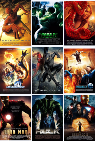
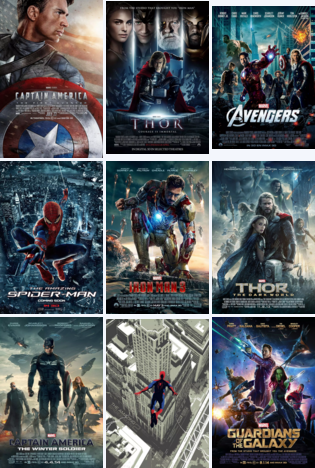
Ant Man 2 was released, and the natural light, as a Training institution for art overseas works collection Although we all know that Marvel's graphic design posters are always famous for their ugliness Layout of collection of graphic design works From the perspective of those Marvel movie posters, what are the poster design knowledge points worth learning. First of all, let's take a look at the poster of the big production movie, how ugly it can be!


Having seen these colorful and uniform Marvel posters, do you think that they all look the same, except that the characters on each poster are changed, and even such posters can attract everyone's attention? yes! Believe me, Marvel can be so wayward! But you! Absolutely not! ours Layout of collection of graphic design works Such content is absolutely not allowed in! Now, let's dig deeply together!
Movie posters are part of the commercial publicity of a movie. Through the form of a sense of design and visual impact, and with the help of showing the highlights, core content or main characters in the movie, they convey the content of the movie in an eye stimulating way to help the movie get more attention and traffic before it is released.
Graphic Design Collection Typesetting Storytelling
An excellent Film poster design It should be a poster that "can tell a story". Even if the story is just a simple visual figure or a simple word, as long as this element is consistent with the content of the film, then it has grasped the propaganda focus of the film and can be regarded as an excellent film poster. Of course, if the form of expression of the poster is more creative and worth thinking about, it will be a more beautiful poster in the show.
In fact, this is not just Poster Design In, in visual arts Medium Graphic Artist Designer The same is true of your graphic design portfolio. Visual Art Collection Project The theme of the story can be seen as the core of the story. You need to use creativity and design to fill the story line completely, enrich the content of the story, and make the design a three-dimensional, full and content work.
Basic information of poster design portfolio layout
Returning to Marvel's posters, having seen the official movie posters over the years, you may find that most of the posters are composed of the main content of the screen with the movie protagonist+its signboard action, and then matched with the standard Marvel style metal gloss font, which basically constitutes the entire content of the entire poster. Every poster is basically satisfied The most basic grid, information, balance and core visual elements in poster design and layout Wait, it seems to be very "orderly" on the whole, and almost can be said to be a great movie poster. But it also lacks some "fun", which makes people feel that designers are lazy.
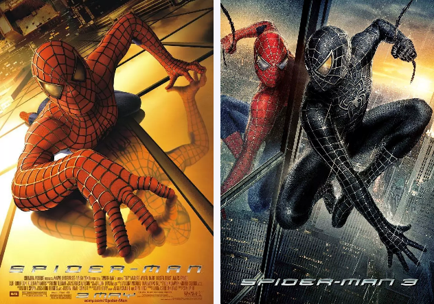
Although the official release of official posters looks similar, there are many surprises, such as Spider Man 1 and Spider Man 2. Although they all take the protagonist as the main picture element, the two posters have chosen different shooting angles from ordinary perspectives, giving the audience a dynamic sense of impact. This kind of composition is more likely to produce a strong effect with visual grip than the ordinary perspective. (You can pay attention to the typography of graphic design works to see their differences)

Visual comparison of layout of graphic design works:
This kind of composition is not only poster design, but also can be used for reference by students of illustration and animation design when preparing professional works of illustration and animation. The unexpected special perspective can often bring unexpected surprises to your pictures, and will also make the general story pictures no longer dull.
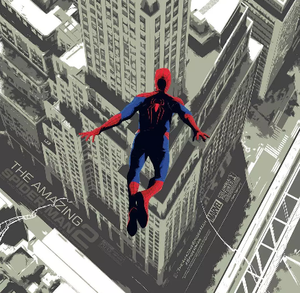
In addition to the two Spider Man movies above, the only thing that can be seen and make people see is the poster of Extraordinary Spider Man 2 made by Sony. It can be said that there is a prominent presence in all the posters. This time, the design uses the retro illustration style. Contrast is a very important point in any visual work, which will bring a strong sense of rhythm and effectively highlight the visual focus. For designers, Color contrast, font contrast, or size contrast are all important parts of poster and visual design In this poster, although the background is a city high-rise, it is unified with a gray tone of lower lightness. In this contrast, the Spider Man with higher lightness and smaller size is particularly eye-catching. At the same time, the visual angle of the screen is higher than that of Spider Man. With the action of Spider Man flying out of the sky, it highlights Spider Man and attracts the audience's visual focus to the characters.

Apart from poster design, "contrast" is also an important principle in the layout of graphic design works. Font, color, size, thickness, shape of graphic elements, etc. can be compared to highlight the primary and secondary. In the layout of graphic design works, when there is only a simple picture, a paragraph of text and a title in the whole layout, the prominent subject can be determined by adjusting the size of the area occupied by the picture and the whole paragraph of text.
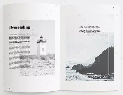
For example, in the layout of the collection of graphic design works below, both black and white and gray tones are used, but the size of the page occupied by the text is somewhat different from the size of the picture. At the same time, different fonts are used for the title and text, and the font size is also compared. Each part is clear and visually focused. The simple elements of several parts have a sense of design in an instant.

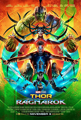
Next, let's take a look at the poster of Thor 3, which seems to have run away from the designer aesthetically. As for this poster, when it was released at the beginning of the day, Marvel fans felt that they were suffocating... So how did this poster make people suffocate? It is as follows:

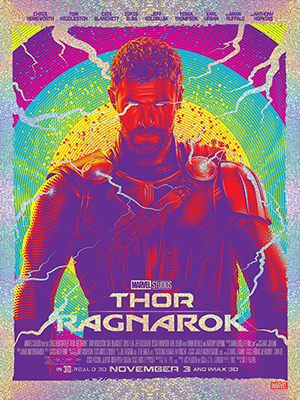
Although after watching the movie, I understood the purpose of the poster in a completely different style from the previous one, but such posters did attract a lot of criticism from Marvel fans. Compared with the above one, the following one Graphic style poster , may look much better. Although the whole poster is also very "colorful", it seems to be much more unified than the one above. We mentioned the contrast in the Spider Man poster earlier. This poster is also because of the contrast. Thor's image occupies the majority of the picture. At the same time, the outer border and the thunder and lightning elements that extend into the picture are also unified in the form of virtualization. There are not many colorful areas in the overall picture, so it is not as hot as the poster above. (Want to Studying in Europe and America Students who set up graphic design works can also learn from the elements

Graphic design portfolio typesetting border design:
At the same time, you should also notice that this poster uses many frames that you like very much in poster design. Here we will talk about the natural light The use of border in poster design la Because many students also like to use borders when designing posters.
Although this form can make the picture appear more orderly and formal, it is often easy to make the picture appear lifeless when used. In this poster, the designer cleverly placed some fonts outside the border. At the same time, the edge of the frame is not completely sealed. The elements of thunder and lightning directly break the frame and extend into Thor's body in the picture. This will not only make the frame more flexible, but also all directional elements (thunder and lightning) point to the focus of the picture - Thor, which is also an attraction to the audience's vision. The font in the figure also uses a form completely different from the previous metal luster of Marvel, which is consistent with the bright silver tone outside the frame, avoiding too many colors in the picture. At the same time, the designer has also made clever treatment on the corners of the font.
This design method can also be used in the layout of your own graphic design collection, but as mentioned in the natural light, try not to completely close the boundary of the border, after all, it is really easy to master the "heat", so that the entire print design "died".
In general, Marvel's posters should be very real, with core elements, composition, story and other contents. But on the other hand, as most people complain, the poster made by rice is often several times more wonderful than the official poster released by the government
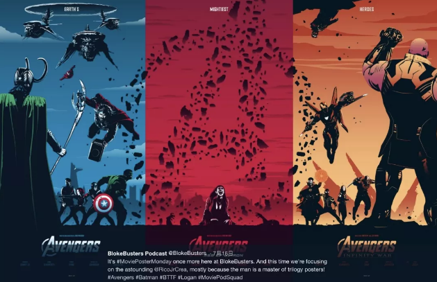
For example, the poster of Thor mentioned above has a designer named RicoJrCrea on Twitter, who has made a more wonderful interpretation of the film:

From the first to the third part of the "Thor" series, each part is a film, which can be mapped separately and contains the story content of the film it represents. At the same time, the three pictures can be combined together, and the overall appearance is also a complete picture. The tone is uniform, but different.
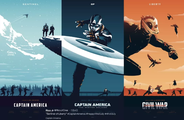
In addition to the three films of Thor, the powerful designer has also designed three linkage posters of other films, each of which is very ingeniously designed.
Avengers 1-3

Captain America 1-3

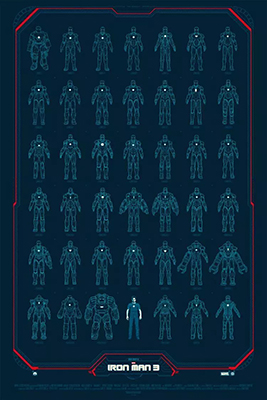
Iron Man 1-3

The collection of graphic design works is arranged in order:
such Contact pictures, actually very recommended Studying abroad in animation or illustration Of students try , apply it to Collection of overseas works a literary creation It can make the pictures have very creative connections.
The following poster is used "Variation" in Poster Design In the poster, all Iron Man's battle clothes are drawn and arranged in order. At the bottom and middle of the screen, Iron Man himself is. All war clothes use the same painting method, giving a unified feeling. However, the existence of Iron Man breaks this closed sense of unity and becomes a small visual focus in the picture, which is more eye-catching and highlights the key points.

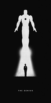
The following poster uses Positive and negative shapes in poster design The positive and negative shape is a very pleasing design method in poster design. The ingenious positive and negative shape can attract more viewers' vision, and more succinctly show the multi-level design intent.
In this poster, the combination of positive and negative shapes is left blank, which makes the picture very visual impact. At the same time, the designer skillfully uses the edge of the empty flame under the Iron Man's battle suit, so that the picture is not too rigid.

I shared so much today The dry goods of graphic design collection typesetting Have you finished your notes? Marvel's poster design It seems to be a metaphysics, but the layout of your graphic design works must not be so psychedelic! If you want to know more about the composition of graphic design works, please consult with natural light!
Natural light can recommend relevant information about layout of graphic design works:
What skills do you have in typesetting the collection of graphic design works for art students studying abroad?
Graphic Design Study Abroad, 25 Graphic Design Works Collection Typography Skills
Layout skills of graphic design works collection: line/color block application_logical clarity
This article belongs to the original article of Natural Light International Art Education Team. Without permission, it cannot be reproduced commercially in any form. If it is found, it must be investigated for legal responsibility.


