Collection typesetting font A seemingly small element, seems insignificant? But it seems to be the "knowledge point" that gives students the most headache? Art study application season The students have entered the stage of finishing and improving the collection of overseas works. I believe many students are facing Graphic design and typesetting font of works There are some problems in the choice of; For example:“ Is the more typefaces the better? ”、“ How many fonts are most suitable for composition ?”... The typesetting font of the collection is so difficult for everyone. Today, Natural Light will tell you about "fonts" and share 30 very practical Chinese and English fonts!
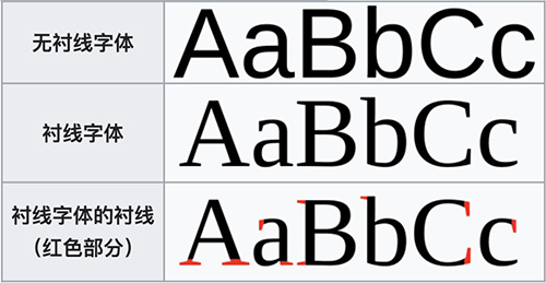
First of all, to understand fonts, we have to mention the formal characteristics of fonts. Generally, we divide fonts into serif fonts and sans serif fonts.
Typesetting font of portfolio --- serif font:
Serif refers to the decorative details at the end of a glyph stroke. The serif font, as its name implies, is a font with a complex shape and a certain turning decoration. In Chinese, the Song typeface is generally represented. In printing, this typeface is often used for text or parts with large text, which is also determined by people's vision and reading habits.
Collection typesetting font - sans serif font:
Compared with serif font, it is a more concise and powerful font. This type of font completely abandons the decorative serif, leaving only the main font, with a higher sense of modernity. It is represented in bold in Chinese. This type of font is generally used for the title, introduction, and advertising copy, and gives people an intuitive visual experience with its direct and capable characteristics.

Image from Wikipidia
In addition to the serif characteristics of fonts, the thickness changes of fonts often also affect the feeling of the typesetting fonts of works collections. Like people, fonts have one or another personality characteristics. Each font has its own special emotions, and different fonts often give people different feelings.
When typesetting fonts in the collection, the overall thickness of the same font will also affect the visual experience of viewers. For example, the font with thick strokes and uniform changes often gives people a visual sense of "authority", "justice", "justice", "calm", "stability"; However, in contrast, with the thinning of the overall strokes of the font, the font will become more and more "soft", "light", "modern", "bright and bouncing". In addition, the thickness change of font details will also affect the overall feeling and display effect of the font. For example, when the font has a slight change in thickness at the turning point, it often gives a smooth and smooth feeling.
After a brief talk about fonts, I believe that you also have a preliminary understanding of the typesetting fonts of the collection. The use of different fonts can often give viewers and users a unique psychological feeling with their different personality characteristics. Next, natural light has listed 20 very practical typesetting fonts of the collection, as well as Chinese and English fonts with a sense of design.
How large is the font used for composition of the collection?
01. Lanting boldface
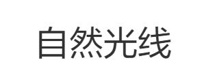
There are many kinds of boldface. I believe you are most familiar with Microsoft Yahei, but today the font recommended by Natural Light is Lanting boldface! It is designed based on the same font as Microsoft Yahei. This set of fonts has a high degree of recognition and practicality, with a full set of Chinese and Western languages.

written words size The example is from the official website of Founder font
02. Founder Youhei
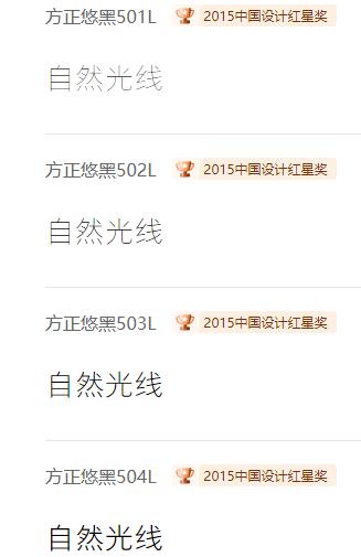
Founder Youhei font series is also a very practical font. Especially for reading, the outline of a single word is clear and easy to identify. In typesetting, Founder Youhei also gives a feeling of smooth, smooth and smooth manual rectification. In addition to traditional printing, it is also very easy to read on the electronic screen display.

written words size The example is from the official website of Founder font
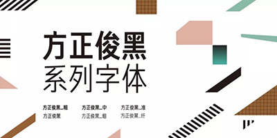
03. Founder Junhei
Compared with the first two fonts, Founder Junhei has a strong sense of sophistication and recognition. Just like the font name, "handsome" is black, and the font is slender, but it still has a strong feeling. This set of fonts was originally used in the guidance system of the National Grand Theater, so the font design is very consistent with the elegant and transparent beauty of the National Grand Theater. At the same time, due to the slender font, it can be used in the manual, packaging box and other parts with smaller font and denser typesetting.

Text size examples are from the official website of Founder font
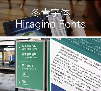
04. Holly font
Holly font is a font that can be used in many languages, including Chinese, Western and Japanese. The original design intention of the font is to use visual magazines as the main object. It is an original font that can not only coordinate with pictures, but also be clearly read. After continuous improvement and modification by the designer, the current holly font is orthodox and traditional, elegant, bright and modern. It is applicable to any printing product, space guiding system, electronic screen display, etc.

written words size The example is from the official website of holly font
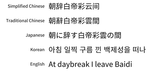
05. Siyuan boldface
The font name comes from the idiom "Think of the origin when drinking water". It is an open source font family led by Adobe and Google. It is a sans serif font. Compared with the previous several boldface fonts, Siyuan boldface has seven font thicknesses. At the same time, the overall font style is more geometric and simple. It can be used in different language environments such as simplified Chinese, traditional Chinese, English, Japanese, Korean, etc.

Text sample from Adobe Typekit Blog official website
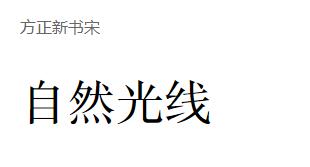
06. Founder's New Book Song Dynasty
Fangzheng New Book of Song Dynasty is an optimized version of the original Fangzheng New Book of Song Dynasty, which pays more attention to science and humanistic sense in design. The font is symmetrical, the turning point is smooth and even, and the overall outline is very neat. It is more readable in reading, and the font use environment is also very wide, especially in the text layout of books, magazines, newspapers, etc.

written words size The example is from the official website of Founder font
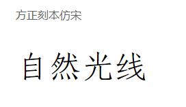
07. Founder Engraving in imitation of Song Dynasty
Which typesetting font to choose for the collection? This is a very classical Chinese font. The design of the font draws lessons from the cutting marks of the characters in the Qing Dynasty's engraved version of "Re publish Ancient Guangyun". In terms of font style, the overall structure draws lessons from the imitation Song typeface, but compared with the imitation Song typeface, this typeface is more square, smooth and level, and at the same time, it has the tenacity of engraving, with Chinese and Western fonts. In terms of use, it is often used for text typesetting of printed matter.

Text samples are from the official website of Founder font
08.Futura
Futura font is a geometric sans serif font designed by Paul Renner and released in 1927. The font comes from Bauhaus, and the font is based on geometric figures, so it is a strong font with geometric beauty. Futura font removes the miscellaneous decoration of serifs, but at the same time integrates the characteristics of geometric figures, making it look balanced and extremely beautiful.

written words size Example from Fonts official website
09.Helvetica
Helvetica should be the most common font in all aspects of our daily life. All kinds of brands and stores, large and small, like to use this font very much. This font was designed by Paul Shaw, an American designer and design historian, and is very, very practical. It is not only the official font of Apple, FENDI, Jeep and other brands, but also the favorite of many art schools. I tell you that this font is used in the logo of UAL.

Text sample from CNN
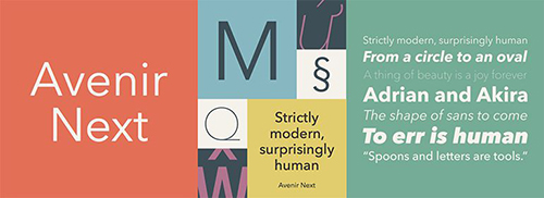
10.Avenir Next
Aviner series fonts were originally originated in 1988. In French, Avenir means "the future". As the fonts in this series show, there are two types of fonts: regular and italic, and the fonts have clear edges and corners, which have a sense of future and simplicity.

Text sample comes from Fonts official website&Google
11.Optima
Optima is an interesting western font designed by Hermann Zapf, a famous German designer. Although it is a sans serif font, the overall font has a slight change in thickness - "horizontal" is a bit thinner than "vertical". This design makes the font clear, but it still has the sense of retro elegance. Such high-quality fonts are also popular among designers.
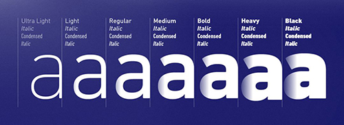
12.DIN
DIN font series is no stranger to designers. It is a series of very realistic fonts, including 48 kinds of fonts. At present, the most frequently used fonts are DIN 1451, FF DIN and DIN Next. Each font has its own characteristics, but it does not lose the original style of DIN. At the same time, this font has been used in German traffic signs and public spaces for decades.


Text examples are from the Fonts official website. From top to bottom, they are DIN 1451, FF DIN and DIN Next
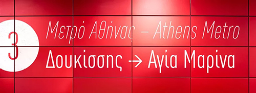
13.Frutiger
Furtiger is a series of fonts designed by Swiss designer Adrian Frutiger. This font was originally designed for the signage and system fonts of the newly built Charles de Gaulle Airport in France in 1968. The appearance design is derived from the Universal font. In addition to retaining the simple and beautiful features of the original font, it also draws on some elements and features of Gill Sans font. Therefore, the entire Furtiger font series has a high degree of recognition and sophistication.
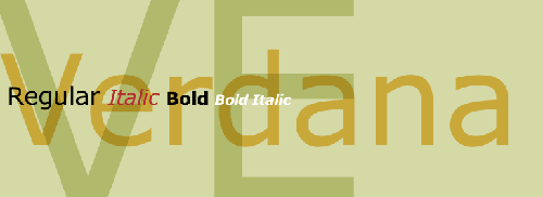
14.Verdana
What type of typesetting is selected for the collection? Verdana font originates from the Furtiger font introduced above, but compared with Furtiger, Verdana is more office oriented and commonly used in web page design and UI interface design. It is still highly recognizable in smaller paragraphs. Therefore, since the introduction of fonts, they have always been one of the standard fonts in many text fields. The most famous case is IKEA's logo. But also because of the office feeling of this font, designers also love and hate it.

Text examples from Fonts official website
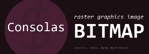
15.Consolas
Consolas, this is a font "specially for program apes", which is commonly used in program settings. The biggest feature of this font is that all characters are of equal width and length. Because of its highly procedural characteristics, this font is also full of a sense of future and formula, so it is used more frequently in the new media art and related fields that are increasingly popular in recent years.

Text examples from Fonts official website
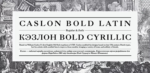
16.Caslon
This is a font with a long history. It has been used since the Declaration of Independence in the United States. The font was designed by William Caslon I, a sculptor. Due to the influence of the historical background at that time, this font has Dutch Baroque style. At the same time, due to its ingenious design, it is also different from ordinary serif fonts. The strong sense of retro style makes this font the favorite of many designers, but at the same time, it is not recommended to use in the title because of its lightness.

Text sample from Google
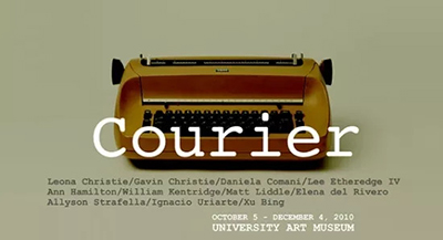
17.Courier
This is a very distinctive font - old ink printer font, designed by Howard Kettler. It is very retro, emitting a strong smell of ink and nostalgic style. At the same time, it is very practical, and often has unexpected use effects in design.

written words size Example from Google
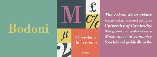
18.Bodoni
Bodoni is an extremely exaggerated serif font with a history of more than 300 years. The strokes of the font and the thickness of the turning point change dramatically and obviously. However, Bodoni is full of a reasonable sense of structure and geometry. This is because in design, Bodoni font has developed the exaggerated proportion to the right extreme. A designer once said: "Bodoni is one of the most elegant fonts in the world". However, due to its exaggerated proportion, although Bodoni can be used in titles or parts requiring striking text, it is not suitable for use in text intensive text. Its most classic use cases are Vogue and CK.

Text sample comes from Fonts official website&Google
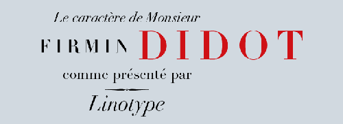
19.Didot
Didot font is also a "story" font, designed by French printer, sculptor and font designer Firmin Didot. Since its appearance, this font has been loved by designers and painters. Compared with Bodoni font, which also has obvious changes in strokes, Didot is more elegant and fluent, more reasonable and readable.

Text sample comes from Fonts official website&Google
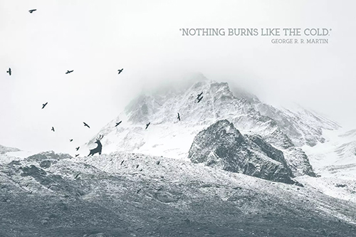
20.Arctic
What is the font size of the portfolio typesetting? This is a very new font. Unlike several English fonts we introduced earlier, this font has a long history. This font is very young, as shown by its font - modern, ice and snow, and a strong sense of body. The serif part of this font is designed very interestingly, and looks as neat as if there is no serif font. Although it is not a common font, it is highly usable and has a high style. However, it is not recommended to use it in large text paragraphs.

written words Size Style Example from BeFonts official website
These are 20 more conventional Chinese and English fonts! We can learn from it Collection typesetting font Medium! The natural light brings you to know 10 styles of fonts that are not common, but are very personalized and highly applicable! Please move to: Collection typesetting font_size_style_collection typesetting font design type
Natural light recommends relevant information about typesetting fonts for your collection:
Graphic Design Study Abroad, 25 Graphic Design Works Collection Typography Skills
If you want to study in British art, what skills do you have in typesetting of graphic design works
This article belongs to the original article of Natural Light International Art Education Team. Without permission, it cannot be reproduced commercially in any form. If it is found, it must be investigated for legal responsibility.


