How to use advanced color in design and creation works? No matter which collection of art and design works, the color matching of the collection serves the pure body here, but still without losing the sense of works. for example Graphic Design Collection Creation Color Matching The characters, symbols and graphics in are more recognizable and readable. For another example, in the creation of design works, the advantageous color matching will not only enhance the texture of your works, but also highlight the theme of your design works. At the same time, it will also bring more optimized visual effects in the overall layout of art and design works. How the Morandi color system in the color matching of today's declassified works reflects a sense of sophistication in terms of complementary colors, contrasting colors, similar colors, and color contrast !
How to still wear a sense of sophistication in winter? I believe everyone knows the matching principle of "Morandi color system", but why is Morandi color system so advanced? Will it become the admiration of all fashion online celebrities and aesthetic bloggers?

Decrypting the Morandi color system in the creation of design works
Today, we will talk about natural light from the perspective of professional aesthetics and color composition
How the Morandi color system works Complementary color, contrast color, same color, color contrast Above, showing a sense of sophistication
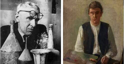
Who is Morandi?
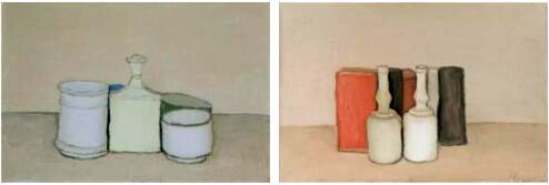
A famous Italian painter, with a highly personalized creative style, uses subtle and subtle colors to explain the beauty of simplicity. Morandi chose very simple everyday cups, plates, bottles, boxes and cans as his painting objects, creating a simple and harmonious picture atmosphere.

Famous Italian painter Morandi
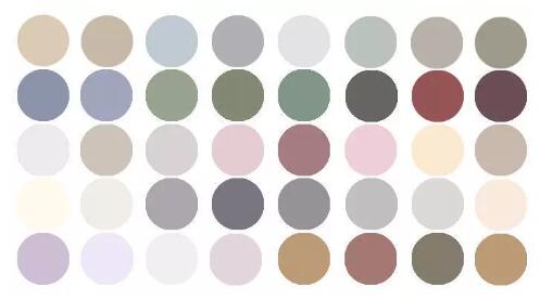
Although the picture has only simple bottles and jars, it is also small in size, but with beautiful, harmonious and high-level color matching, it has become a very popular color book. This color system extracted from Morandi's paintings is what we often call "Morandi color system".

Morandi
Where is the Morandi color senior?
Students studying art design should have heard of it Advanced Gray The term "advanced gray" is not the gray of various color scales that many bloggers say on the Internet, Advanced gray refers to a color relationship of all colors in the state of non high saturation and high brightness.
The Morandi color system is a manifestation of "advanced gray". The production of this hue is actually closely related to Morandi's own painting habits. Morandi always first uses colors with higher lightness and saturation as the "base" when painting, and then constantly covers other colors on the screen, so as to blend multiple colors.

Morandi's Landscape Painting
In the process of color matching of this work set, individual colors are constantly reducing saturation, but the final harmonic color does not appear "dirty" because of mixing, but instead becomes a color with advanced aesthetic feeling. Each group of colors has a color tendency, as well as a cold and warm contrast.
In such a relationship, even if complementary colors or contrasting colors are used at the same time, they will appear very advanced, durable, and even more stable and elegant.

Complementary or contrasting colors of Morandi colors in color matching of design and creation works
How to use "advanced" complementary color, contrast color and similar color?
When it comes to complementary colors, contrasting colors and similar colors, we should first know about them Hue ring
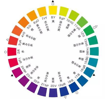
As we all know, the three primary colors are Red, yellow, blue Three colors, and hue ring is a ring expanded from three primary colors. The most common hue rings are 12 color hue ring and 24 color hue ring Both contain Primary, secondary and tertiary colors 。
Red, yellow and blue form a tripartite balance in the hue ring, The secondary colors are orange, purple and green, which are the colors formed by blending the primary colors in pairs; Tertiary color is composed of secondary color and primary color.

Morandi color system in color matching of works 12 color hue ring

24 color hue ring
After understanding the hue ring, we will focus on "complementary colors", "contrast colors" and "like colors":
Complementary color -Refers to the angle of 180° For example, we often talk about three complementary colors: red and green, blue and orange, yellow and purple.
Contrast color -It is not as strict as complementary colors, which means that the angle on the hue ring is 120°-180° In theory, complementary colors should also be included in contrast colors. For example, pink and green are contrasting colors.
Homogeneous color -The same kind of color must be very similar. Generally, it is 30° The colors between, such as lemon yellow and medium yellow, are the same color.
advancing colour -It should be emphasized here that the difference between similar colors and similar colors must be clearly distinguished. Similar colors have a wider range of angles on the color phase ring than similar colors. Generally 60° In other words, similar colors belong to similar colors. We can give an example of similar colors but not the same color: lemon yellow and orange.

Schematic diagram of complementary color, contrast color, similar color and similar color of Morandi color system in color matching of design and creation works
For beginners of color, if they want to make no mistakes in color use, they will never make mistakes in using similar colors. But, just make no mistakes, are you satisfied? If you want the color of your work to be more durable and simple, in fact, you can skillfully use complementary colors and contrast colors, which can sometimes produce advanced effects. If you say that the contrast color will produce the effect of Northeast calico, it must be your mistake!
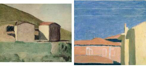
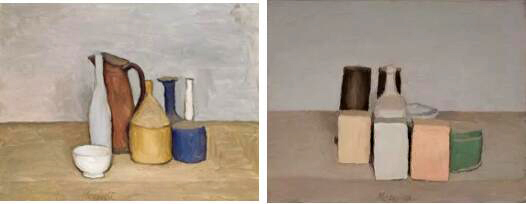
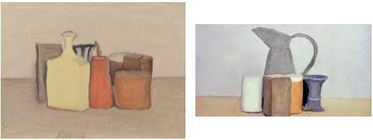
Now we are going back to the advanced Morandi color system. The first of the following two Morandi's works uses Blue with yellow and purple tints , the second work uses Green and warm orange red These two groups of colors belong to Contrast color But why is there no "big calico" effect on the picture, but it is also very durable?

By comparing the use of these two groups of red and green complementary colors, what is obvious in Morandi's picture on the right... (Don't need to say more about natural light?) is more than a little bit beautiful. There is obvious psychological contrast, and the right side is more comfortable and easy to accept.

When using complementary colors or contrast colors, we also tend to emphasize that the balance between two colors can be reconciled by changing the difference between the two colors, that is, "strong contrast" hue. One color is used as the main color, and the other color is used as the "auxiliary". The saturation (chroma/purity/chroma) or lightness (brightness) can be reduced accordingly. By enhancing this contrast, the picture can appear primary and secondary, And it has visual effect.
As mentioned above, this is an ordinary operation, but Morandi is different. He uses "advanced operation", not strong contrast, but weak contrast. The "saturation" color relationship caused by color reduction is not sharp, which makes the saturation of red, yellow and blue very low and the lightness very close. Therefore, "Weak contrast" is better than "strong contrast" It's more difficult. If we can't grasp the tiny difference, we will feel "blurred", "anemic" and "spiritless" in the picture of weak contrast

On the other hand, Morandi's pictures are all low saturation, low contrast, but very clean and simple. That's why they are so advanced.
Morandi used "Same brightness" The relevant graphics have been re integrated, and the "same color" has re created the overall structure, increasing the pleasure of the viewer to find many times. At a close look, the cool and warm fresh gray colors are both contrasted and soft, immersed in the simple, calm and calm temperament.
How to use advanced colors in album color matching?
When using color, we should understand that no matter what environment or profession, Color serves the pure body in the creation of design works, but still not lose the sense of works Color is a tool to increase visual and psychological effects for any work or profession.
For example, in the creation of poster design works collection, not only the color matching of poster poster itself should be considered, but also the surrounding environment color should be considered according to the location and location of its placement to coordinate with the environment to achieve the best visual effect, while ensuring that the text, graphics, and symbols are more recognizable and readable.
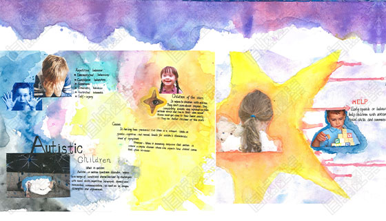
For another example, in the creation of works collection, the advantageous color matching will not only improve the texture of your works, but also highlight the theme of your works. At the same time, it will also bring more optimized visual effects in the overall layout.

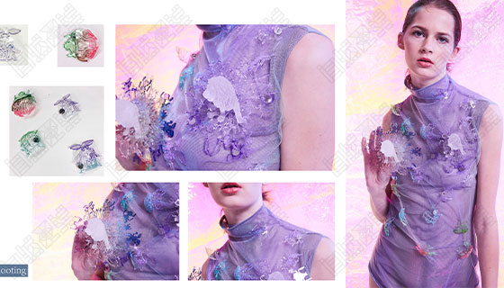
Creation of student's clothing design works in natural light
The study of color is not an overnight thing, especially the training of color sense is accumulated over time. The training of color is an important compulsory course for students majoring in graphic design, interior design, pure art, illustration, clothing, etc.
This is one of the reasons why natural light attaches great importance to students' basic courses. Understanding the importance of color matching, knowing how to apply color, and having a good sense of color will greatly improve your creation.

Creation of student's clothing design works in natural light
By capturing the essence of those simple things and the familiar scenery, we make our creative collection design exude a simple, elegant, fresh, wonderful and intimate sincerity.
Usually pay attention to reading relevant magazines, books, or watching TV movies, pay attention to the control of color tone, and consciously put it into their daily training, which will make color learning more interesting and efficient. Even if we are dressing, we also dress more attentively than others!
More about Articles of design and creation collection:
What can't be ignored in the process of portfolio training_creating_art overseas portfolio
The creation syndrome of overseas art works collection, lack of confidence, anxiety, and natural light give you the best training recipe for art works collection!
This article belongs to the original article of Natural Light International Art Education Team. Without permission, it cannot be reproduced commercially in any form. If it is found, it must be investigated for legal responsibility.


